hubspot.com
Landing Page Analysis
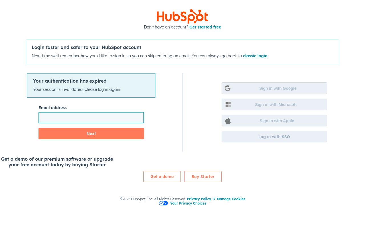
Sign into your HubSpot account through HubSpot's login page. No login? Signup for a free account.
49
Generated on:
October 23, 2025Score:
49/100Audience:
Travel management companiesShare on:
Summary:
45
Messaging
60
Readability
65
Structure
40
Actionability
50
Design
20
Credibility
The landing page prioritizes functionality but lacks in aesthetics and engagement. While the login methods are diverse, the design is uninspired. The juxtaposition of text elements leads to a disjointed experience, with critical CTAs like "Get a demo" and "Buy Starter" looking bland and not standing out. Contact methods are varied but not emphasized, making the lower section feel secondary rather than supportive of the main action. Sparse and too segmented design choices leave an impression of neglect, sacrificing user delight for basic utility.
Main Recommendations:
- Enhance CTA buttons with contrasting colors to make them more attractive and noticeable.
- Use more engaging headlines or brief text to clearly communicate the benefits beyond just logging in.
- Improve visual elements by using icons or graphics to support critical actions.