refliply.com
Landing Page Analysis
Welcome to our store
75
Share on:
Summary:
70
Messaging
85
Readability
60
Structure
78
Actionability
72
Design
60
Credibility
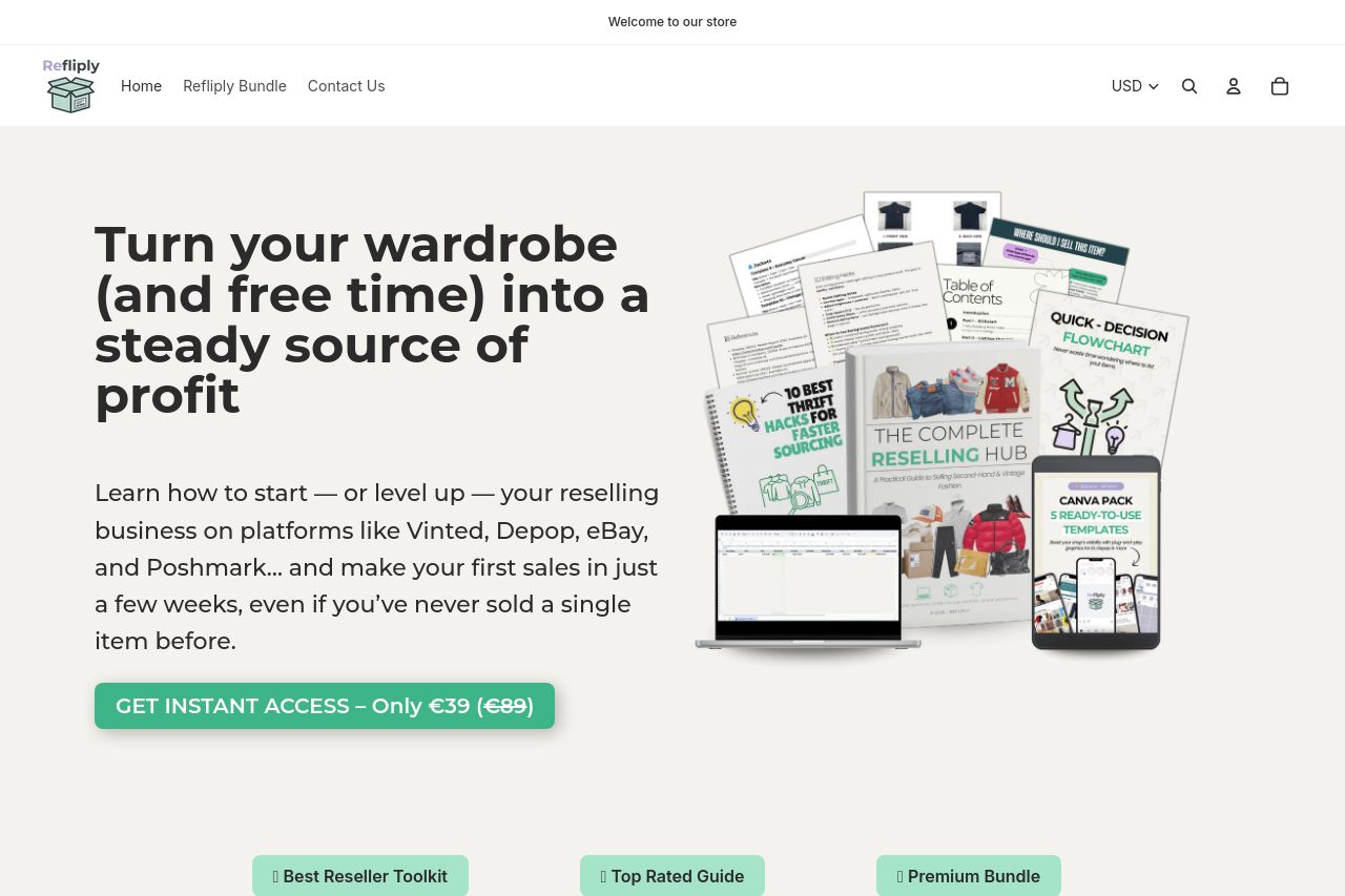
The Refliply landing page is visually concise yet persuasive in some aspects. The value proposition is front and center: transforming your wardrobe into a profit source is clear and repeated effectively. The use of bold sections and a mix of images connects well with the audience trying to sell online. On the downside, the visual hierarchy could use more consistent font sizing to emphasize the most critical parts. Some section transitions aren't smooth, making the flow a bit choppy. Testimonials are helpful but look unrelated to the page's main product, casting doubt on authenticity.
Main Recommendations:
- Revise testimonials to ensure they are directly related to the product being sold.
- Enhance font sizes and heading distinctions to improve visual hierarchy and section transitions.
- Add more visual elements related to reselling platforms to align with the audience's interests.