google.com
Landing Page Analysis
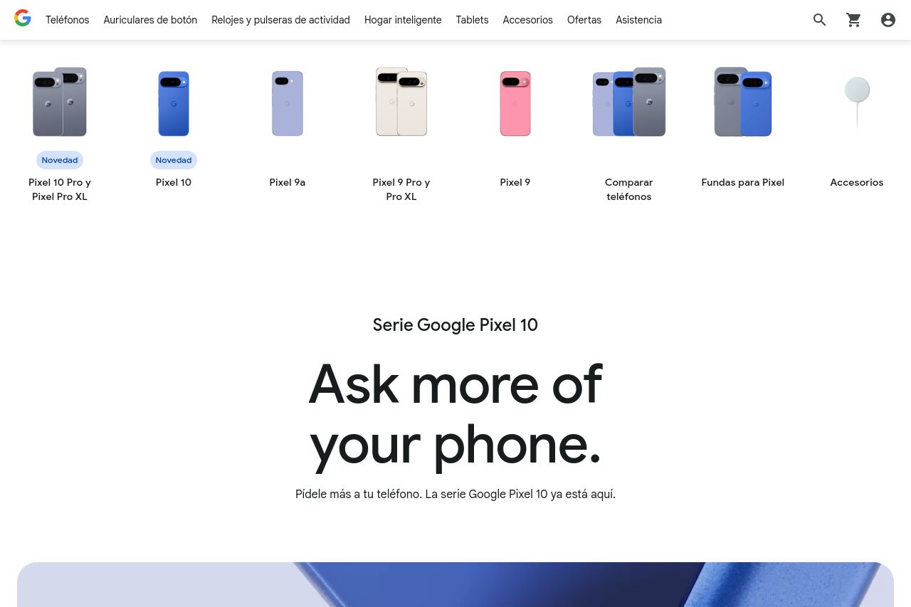
Compra los smartphones Pixel 10 más recientes: Pixel 10, Pixel 10 Pro y Pixel 10 Pro XL. Disfruta de nuevas funciones cada pocos meses con tu smartphone Google Pixel.
Summary:
This page has a chic design and a minimalistic approach, which works well visually but lacks some punch in messaging and interactivity. The "Ask more of your phone" line is catchy, but the follow-up with product details could be more pronounced. Images are striking and well-selected, enhancing the clean look, but some might argue that they overpower the textual content, blocking out details. The navigation flow is smooth, yet the user could feel lost due to a somewhat vague hierarchy in spots. Call-to-action buttons are clear, but they could have a more pronounced focus to push engagement. While there’s precise information about features, it could use more customer-centric benefits to catch the consumer’s emotions. Overall, the design elements are cohesive, but there's room for improvement in content delivery and persuasion techniques.
- Emphasize benefits in the hero section to connect emotionally with users.
- Enhance CTA buttons with more vibrant colors or animations to draw attention.
- Include more customer-centric language to differentiate from a purely technical focus.