salespopups.com
Landing Page Analysis
Show real Stripe sales to visitors instantly. Increase conversions with authentic purchase notifications that build trust. Works with any website.
Summary:
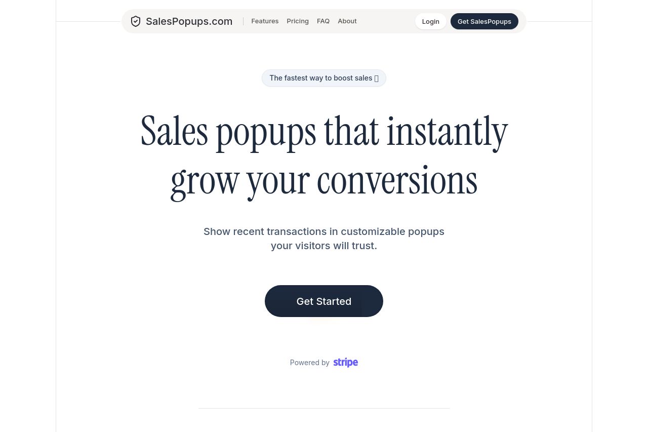
The landing page does a solid job explaining the value proposition right from the start. The headline "Sales popups that instantly grow your conversions" clearly conveys what the service offers. However, it lacks engagement in the rest of the messaging, feeling a bit generic without direct addressing to specific businesses or needs. The descriptions are text-heavy, potentially overwhelming without sufficient visual breaks or standout features. The design itself maintains good consistency with a clean, professional look, but could use more vivid imagery to strengthen clarity and interest. Its CTA buttons are visible but not necessarily compelling, needing stronger, action-driven language. While the credibility is well-backed by mentions of Stripe and a founder testimonial, it could further benefit from more diverse client logos or reviews to build trust.
- Use more targeted language that directly addresses B2B needs or pain points.
- Incorporate more visual elements or icons to break text-heavy sections.
- Enhance CTAs with action-driven, specific language like 'Boost Conversions Now.'