firmable.com
Landing Page Analysis
Sales leaders.
Summary:
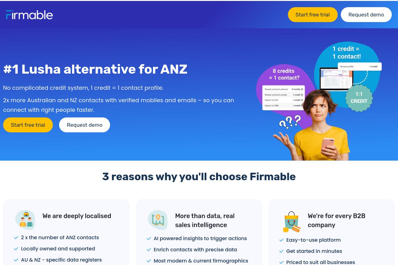
Firmable's landing page aims to capture Lusha's audience but falls short in several areas. The value proposition lacks clarity, and it fails to address specific pain points for Lusha alternatives seekers. The page benefits from a professional and clean design, yet the visual hierarchy could use significant improvements to better guide the audience. Credibility elements like client logos and social proof are scarce, and this damages trust. Readability is mixed; while text simplicity is fair, the typography and layout could be more engagingly executed. There are important details lacking, like pricing, which affects user confidence and decision-making. Moreover, CTAs blend into the content too much, diminishing actionability. Overall, the page seems designed well in structure but falls apart when it comes to effectively engaging and converting a Lusha-minded audience into customers.
- Clarify the main value proposition to immediately address Lusha user's alternative needs.
- Enhance social proof by adding customer testimonials or recognizable client logos.
- Improve CTA prominence with a more vivid color and engaging action-oriented text.