joinklinik.com
Landing Page Analysis
Gestiona tus citas médicas de forma fácil y rápida.
Summary:
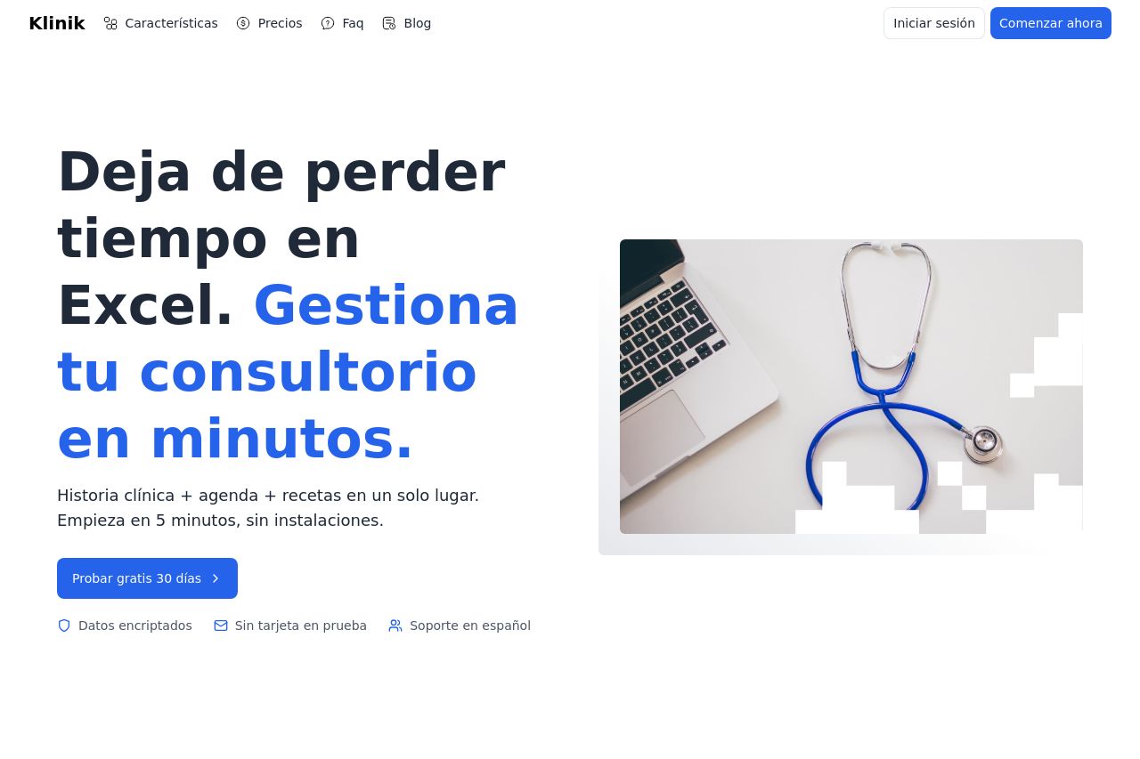
Overall, the landing page for Klinik is quite straightforward and gets its point across. The headline, "Deja de perder tiempo en Excel. Gestiona tu consultorio en minutos," clearly conveys the primary benefit—saving time. The "Probar gratis 30 días" call-to-action is prominent, encouraging users to try the product without immediate financial commitment. The layout is clean and not cluttered, which is essential for readability. The visual hierarchy is well-maintained with clear section distinctions, even though the color palette is a bit monotone and could use more variance. Moving to the testimonial section, it's positioned to add credibility but could be more visually engaging. Pricing is laid out clearly with distinct plans but might benefit from more emphasis on value beyond just cost.
- Introduce more color variety to break monotony while maintaining professional aesthetics.
- Enhance CTA visibility with a contrasting background or button color.
- Include more engaging visuals or icons in the testimonial section.