freefrom.cloud
Landing Page Analysis
Expert DevOps consulting to migrate your infrastructure from AWS, Azure, GCP to cost-effective on-premise solutions. Save 40-70% on cloud costs with zero downtime. 15+ years experience.
Summary:
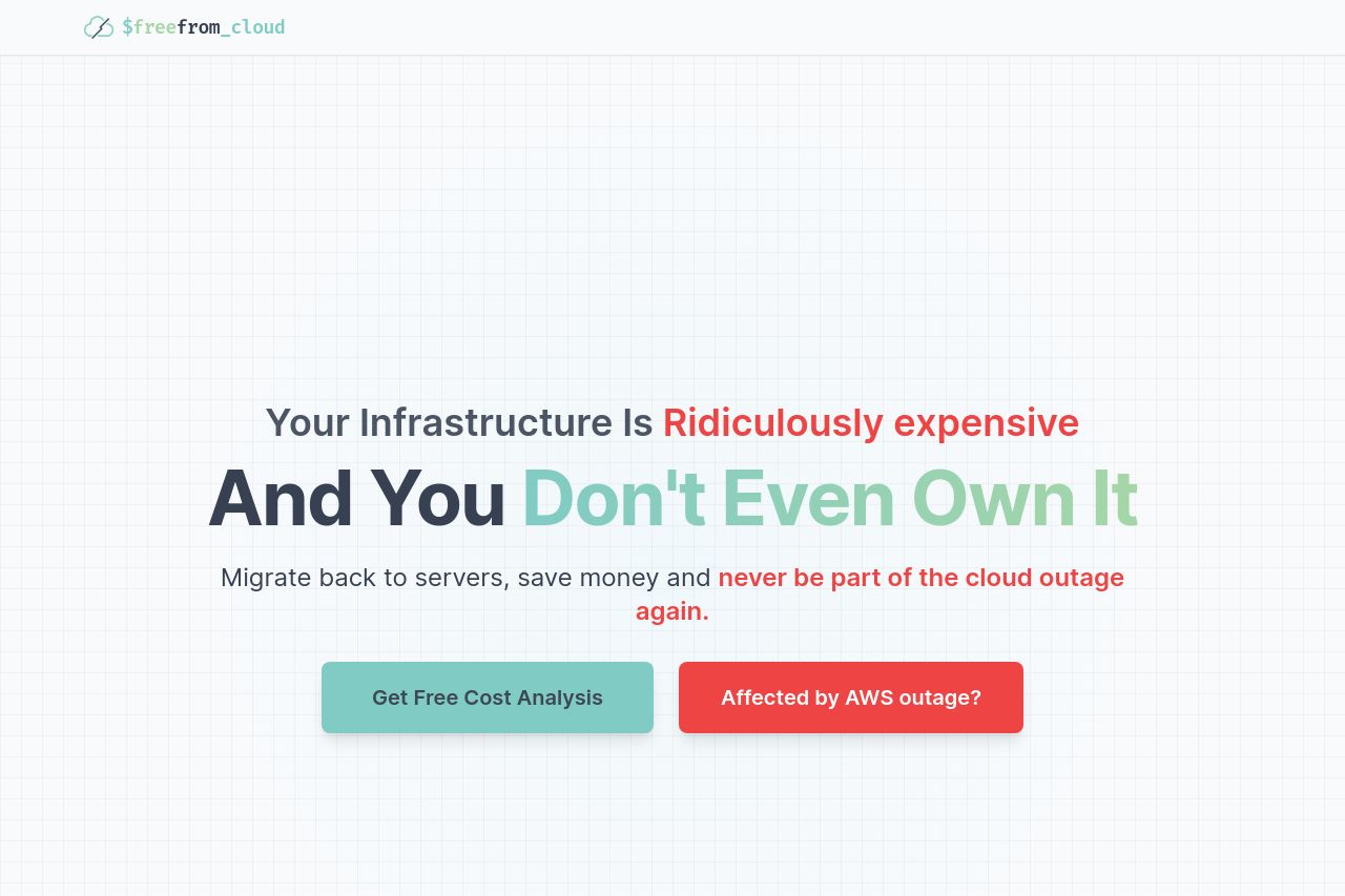
The landing page for FreeFrom Cloud aims to address concerns about cloud infrastructure costs. The bold claim in the hero section grabs attention with its striking colors and direct language. However, the overall message gets diluted with an overly simplistic tone that might not fully resonate with the DevOps audience.
Each section generally flows well into the next, but the call-to-action (CTA) sections lack a strong visual emphasis, making them blend in rather than stand out. The testimonials are a positive touch, adding credibility, but the design could use more refinement in font choices and color usage to enhance hierarchy and readability. The featured process is reassuring, guiding the user through the migration steps, yet the extensive copy in sections can cause the reader’s attention to drift.
Overall, credibility is reasonably built through testimonials and a focus on expertise, yet some additional social proof like more detailed case studies or recognizable logos could enhance trust even further.
- Enhance visual hierarchy by using varied font sizes and weights to emphasize important content.
- Rework the call-to-action sections to make them more visually striking and compelling.
- Include more detailed use cases or case studies to better demonstrate successful migrations for the target audience.