milesight.com
Landing Page Analysis
Milesight provides global leading AIoT Solutions and surveillance system with best-in-class network camera and NVR for security surveillance system and AIoT industry.
Summary:
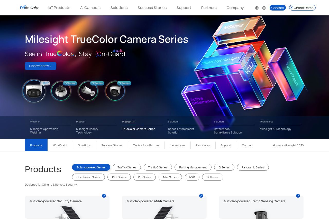
Milesight's landing page straddles the line between functional and forgettable. Visually, it pulls you in with a solid, professional look, but the endless input fields in that contact form are just overwhelming. The site needs more focus and urgency in its CTAs to drive engagement. There's a sleek, cohesive design, but it feels a bit corporate and lacking personality. Messaging is crisp yet somewhat generic, not clearly hitched to a specific audience. The layout flows decently, but there's clutter—that notification pop-up is a big distraction. Credibility is solid, but with a bit of polish, this could be a go-to name in the surveillance tech industry.
- Reduce the number of fields in the contact form to prevent user overwhelm.
- Enhance CTAs with more action-oriented and specific language to increase conversions.
- Improve messaging to clearly target a specific audience, highlighting their specific pain points and needs.