adobe.com
Landing Page Analysis
63
Generated on:
October 22, 2025Score:
63/100Share on:
Summary:
40
Messaging
65
Readability
65
Structure
45
Actionability
70
Design
75
Credibility
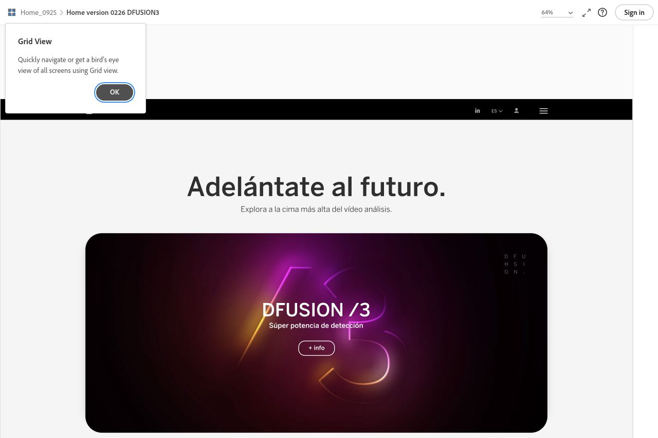
The landing page is visually appealing with a sleek, modern design. However, it struggles with clarity and messaging. The main value proposition is vague; "Adelántate al futuro" doesn't communicate what the product does. The visuals are bold, but not complemented by strong, clear headlines or copy that explain the benefits or features. The CTAs blend into the page, making them easy to miss. The flow of information is decent, but additional context and examples are needed to better explain the offerings. Trust elements are present but could be reinforced for more credibility. The typography is simple and unobtrusive, but some sections feel cramped. Improving clarity and focus on calls to action should be priorities.
Main Recommendations:
- Clarify the main value proposition immediately with specific benefits and features.
- Enhance the visibility and actionability of CTAs to guide users effectively.
- Provide clearer, specific examples or use cases to better illustrate the offerings.