davantis.com
Landing Page Analysis
Discover our solutions: Smart Video Analytics Software based on Deep Learning for Perimeter Security CCTV. Learn more!
Summary:
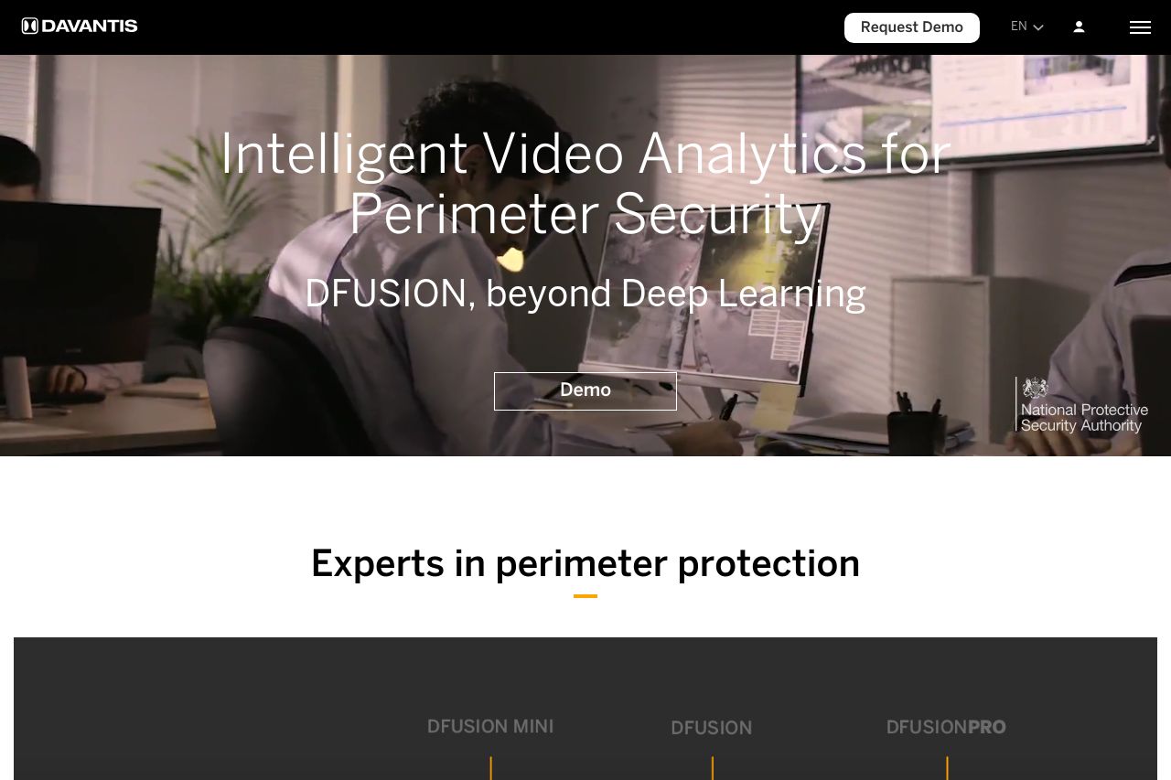
The landing page is visually engaging and professional, which is vital for conveying trust in a B2B context, especially in security. The hero section immediately highlights the product's core offering with a clear headline, though the secondary message about "Deep Learning alone is risky" might confuse some readers without additional context. It's good to see a call to action ("Request Demo") clearly positioned, but it competes with the ubiquitous demo banners everywhere, which might feel overwhelming.
The overall design is consistent, using a cohesive color scheme that fits the security theme. However, the CTA banners repeated at the bottom of each screen give a cluttered feel and could distract users. Text readability is mostly solid, although some fine print (like in the newsletter section) risks losing reader attention due to lack of engagement.
Content organization is logical, but the flow could be smoother. The heavy swapping between different sections could disrupt navigation for users trying to follow a coherent storyline. Trust elements are robust, with office locations and partnerships displayed, assuring credibility.
Typography is generally clear, but more distinct headings could improve quick content scanning. The invitation to book demos is straightforward, but lacks urgency -- perhaps employ language that pushes potential clients to act immediately.
- Reduce repetition of demo CTA to avoid clutter.
- Explain or clarify the 'Deep Learning alone is risky' statement.
- Use more engaging and less repetitive language for CTAs.