lovable.app
Landing Page Analysis
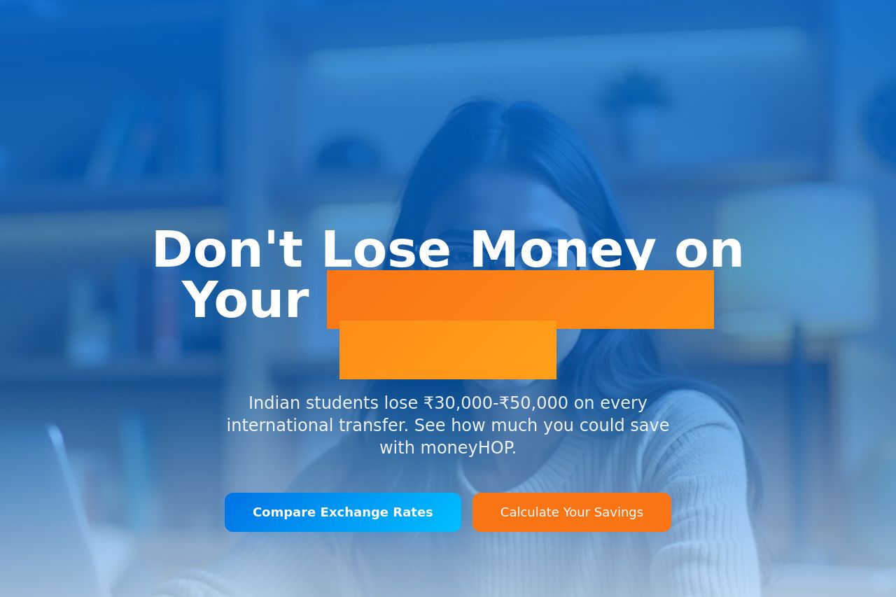
Indian students lose ₹30,000-₹50,000 on international transfers. Compare live exchange rates, transparent fees, and save money on your study abroad journey with moneyHOP.
Summary:
The landing page attempts to resonate with Indian students studying abroad by highlighting costly fees associated with international transfers, but it falls short of being gripping. The hero section starts off promisingly, warning about financial loss, but its impact is diluted due to distracting visual elements. The value proposition is relevant, but the delivery feels repetitive across the sections. Messaging lacks depth and primarily reiterates the initial points instead of adding value as users scroll down. There’s a lack of compelling imagery and unique visuals that disappoints. Credibility aspects, such as testimonials, are watered down by the broken design, damaging trust perception. Calls to action (CTAs) are present and decently worded but don't pop enough visually. The structure, while linear, misses opportunities to engage users in multiple ways. Overall, it's a serviceable page but needs a stronger emotional pull and more functional visual design.
- Refine and simplify the hero section for better readability and impact.
- Add engaging, authentic testimonials or student stories with visuals to build credibility.
- Enhance the CTAs visually to make them more compelling and distinguishable.