joinhive.app
Landing Page Analysis
Where neighbors become first responders. Join the mission for safer communities.

Summary:
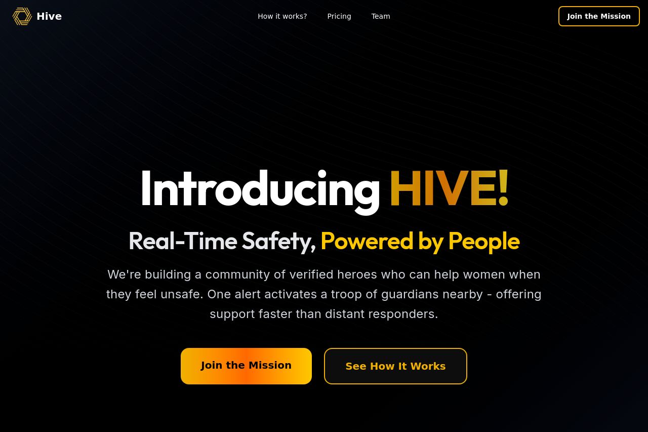
The Hive landing page does a great job at visually engaging the audience with a strong, black and yellow color scheme that aligns well with the theme of urgency and safety. However, the Open Graph data is entirely missing, which could hinder its visibility on social platforms. The main value proposition is clear: real-time safety powered by people, which appeals directly to the target audience. The storytelling approach with the SOS scenario is effective but could be streamlined further for clarity. Though the design is generally cohesive, some typography choices and layout arrangements could use enhancement to improve readability and ensure the call to action stands out even more.
- Add Open Graph data for better social media representation.
- Improve text contrast in some areas for better readability.
- Enhance the visual hierarchy to make the CTA stand out more.