epark.jp
Landing Page Analysis
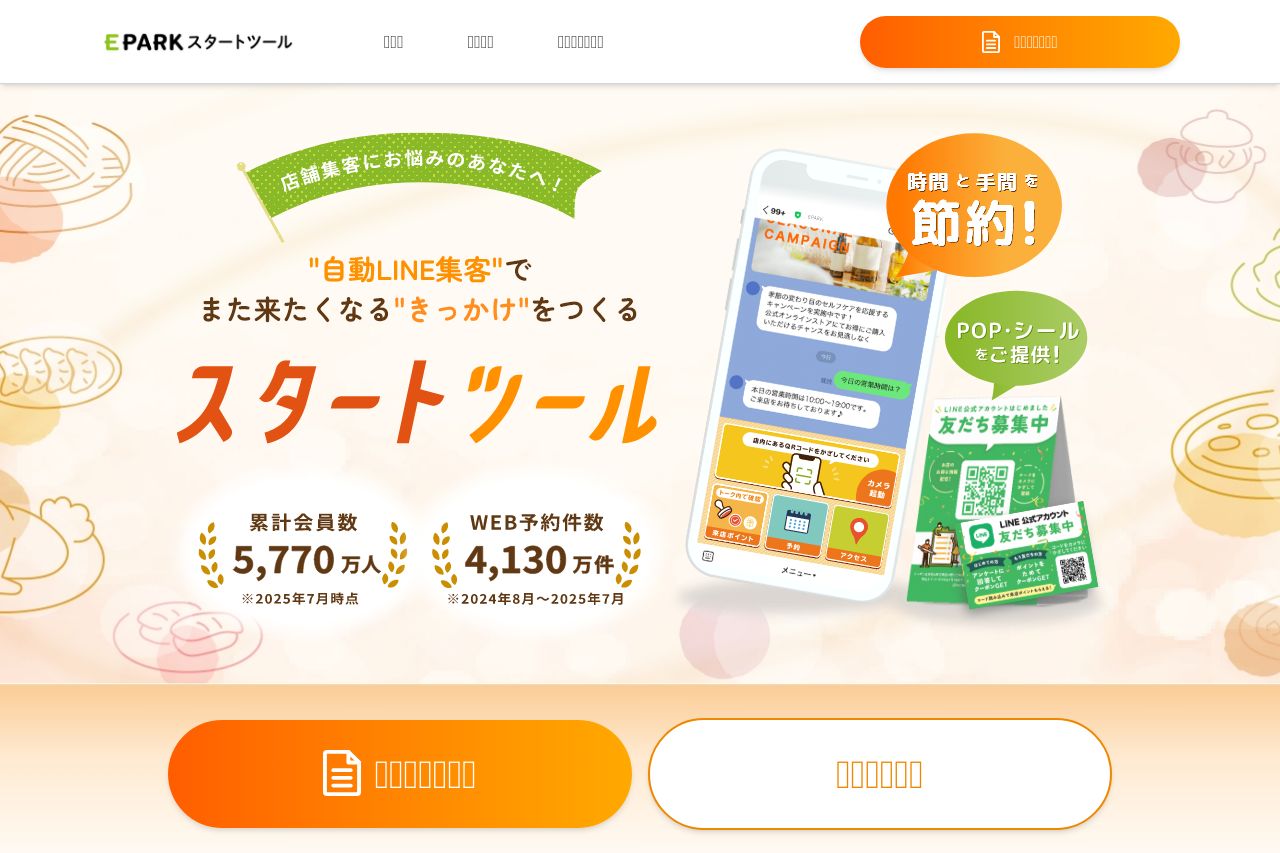
リピーター集客に悩む飲食店の方へ。LINE公式アカウントなら、クーポンや再来店メッセージを自動で配信し、リピーター獲得をサポートできます。何通配信しても定額、セキュリティ対策も万全。安心して使える飲食店向けツールです。
Summary:
The landing page has a fresh and engaging design but falls short on clarity and messaging. The visuals are light and friendly, using a soft color palette that gives a welcoming feel. However, the page suffers from missing or unclear text due to potential encoding issues, which severely hinders communication. The call-to-action buttons do stand out well, but the content lacks explicit explanation about what the tool is or how exactly it benefits the user. Consistency in design is good, but the lack of transparent information makes it difficult to trust and understand the offering fully. Visual aids are pleasant but don't replace missing key textual elements.
- Fix text encoding issues to ensure all information is clear and readable.
- Provide a stronger, more explicit value proposition that clearly explains the tool's purpose.
- Ensure transparent communication about the product's features and benefits to build trust.