topratedselection.com
Landing Page Analysis
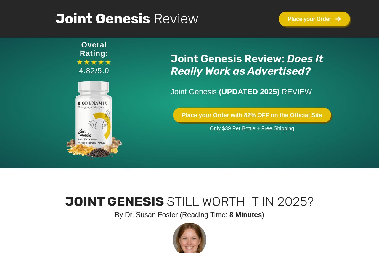
If climbing stairs or getting up from a chair has started to feel harder than it used to, you’re not alone. More than 70 million adults in the U.S. experience some form of joint stiffness — and most o
Summary:
The landing page for Joint Genesis lacks cohesiveness and clarity. While the visual hierarchy is established with bold headlines and some contrast in colors, the overall structure feels cluttered. The constant repetition of CTAs makes it overwhelming rather than persuasive. The abundance of text is likely to deter readers. Although there are attempts to address credibility through reviews and ratings, they appear forced and overused. The tone comes off as generic and doesn't create a strong connection with the audience. There's a decent try at explaining the product in terms of benefits and ingredients, but the information is too scattered. All in all, the site could use a significant overhaul in structuring content, simplifying the message, and enhancing focus.
- Reduce and consolidate repetitive CTAs to avoid overwhelming users.
- Streamline content for clarity and focus. Avoid too much text in one section.
- Enhance the credibility through genuine testimonials and verified reviews.