deskbreak.app
Landing Page Analysis
Take regular desk breaks with customizable reminders. Improve your posture, reduce eye strain, and boost productivity with healthy work habits.
Summary:
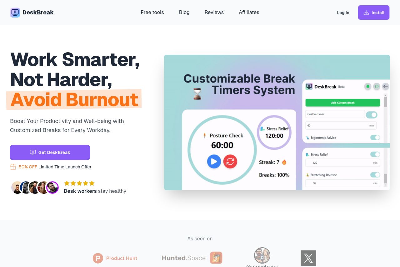
The landing page for DeskBreak is clean and visually appealing, which is a strong point. The hero section quickly introduces the main idea of the product: avoiding burnout by taking customized breaks, supported by a relevant image showing the product interface. However, the overall messaging could be more targeted to specific audience segments, as it feels slightly generic in places. The site does emphasize the benefits but lacks a bit of emotional connection that might appeal more directly to potential users.
There is a cohesive color scheme which aligns nicely with the product's purpose, contributing positively to user experience. While the typography is clear, the call-to-action buttons could stand out more to increase conversion. The logical flow and structure are generally effective, with testimonies and benefits placed strategically. However, writing could be more succinct, and repeated messages about customized breaks get a bit redundant. Social proof is present and helps build credibility, but the lack of notable recognitions or trust signals could be a downside.
- Enhance the contrast and placement of CTAs to make them more prominent.
- Make the messaging more targeted at specific user segments.
- Add more powerful trust signals like recognition badges or notable partnerships.