x20.io
Landing Page Analysis
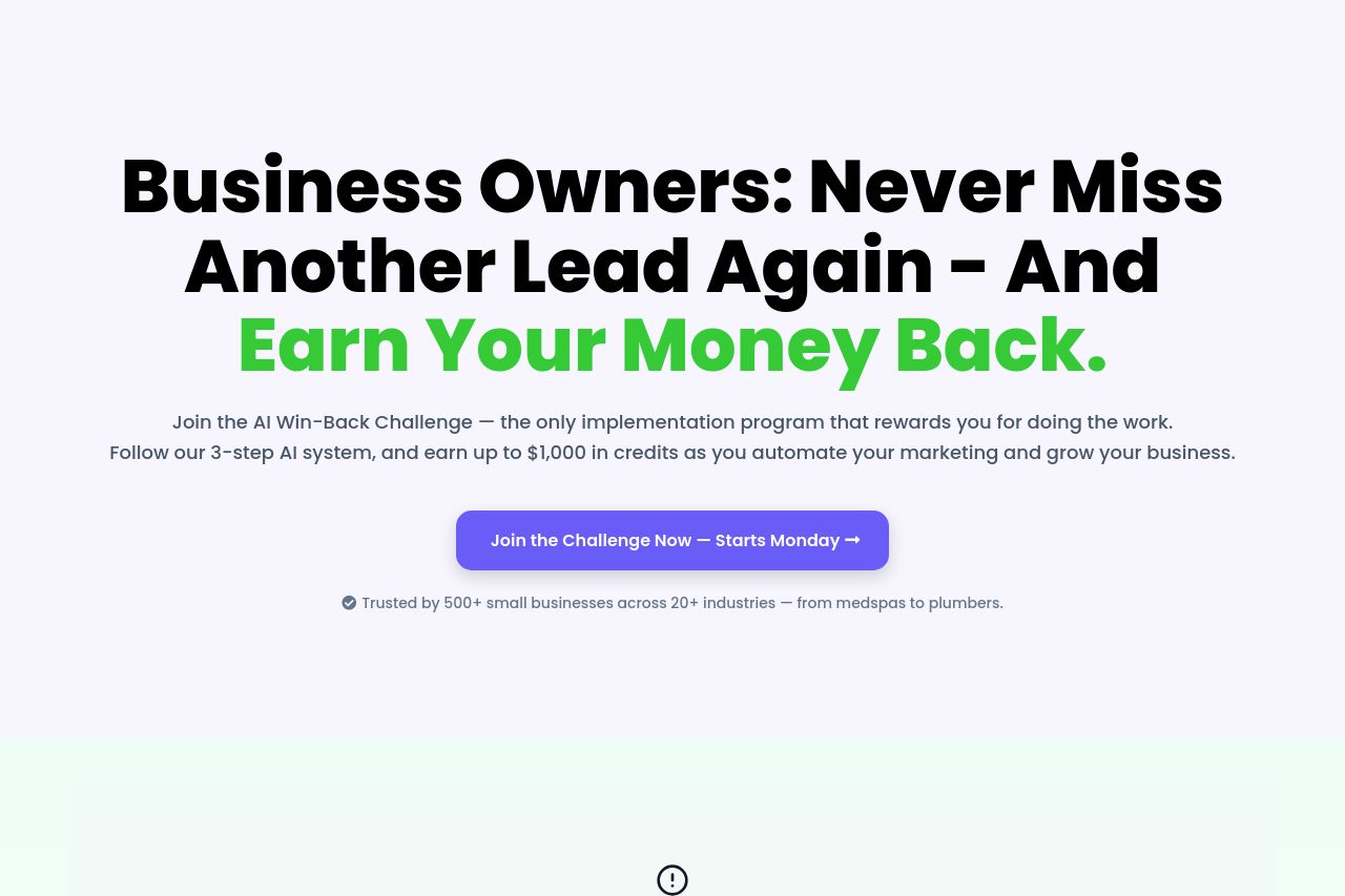
AI Win-Back Challenge Landing page
Summary:
The landing page has its strengths but several weaknesses as well.
The value proposition is clear, targeting business owners with a promise they can't ignore: 'Earn Your Money Back'. This is reiterated throughout, enhancing its appeal. However, the messaging can feel somewhat generic and lacks depth in explaining how exactly the solution is achieved.
Readability is pretty decent, with clear fonts and simple language. However, the text could definitely be simplified further to cut the fluff and make it punchier for business owners who scorn verbosity.
Design-wise, the page looks sleek with a pleasing color palette. Nonetheless, the visual hierarchy is not optimal, with some sections cluttered by overcrowded text blocks, which could turn off any prospective client.
In terms of structure, the page persuades with its logical buildup but sometimes overwhelms with text-heavy sections.
CTA placement is a highlight. Placed strategically, they do catch attention. However, the urgency and distinctive aspects of the buttons can be pumped up for an added edge.
Finally, the credibility elements are robust with satisfying testimonials and client logos showcased, which builds trust efficiently. Nonetheless, a little more transparency about the company wouldn't hurt, adding contact forms or more personal touches, such as founder stories, could further solidify trust.
- Simplify and clarify the messaging further to be more direct.
- Enhance the visual hierarchy to better guide the reader's focus through the page.
- Add personal stories or further details about the company to build trust.