my.id
Landing Page Analysis
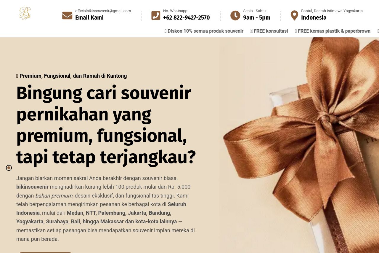
Bingung cari souvenir pernikahan yang premium, fungsional, dan tetap terjangkau? Bikinsouvenir menyediakan 100+ pilihan souvenir eksklusif dengan bahan premium, desain elegan, dan kemasan mewah untuk
Summary:
The landing page for Bikinsouvenir has several strengths, but it also has areas that need improvement.
The good: The site offers a clear and engaging value proposition right from the start with the headline "Bingung cari souvenir pernikahan yang premium, fungsional, tapi tetap terjangkau?" which speaks directly to the target audience's desires. The images of the products are attractive and complement the descriptions well. The layout gives enough breathing space, preventing overcrowding of elements.
The bad: However, there are too many competing elements for attention at the same time—like the countdown timer's urgency next to the regular product offerings, which might overwhelm users. The font sizes and styles sometimes lack consistency, and the colors, while generally okay, don't always provide enough contrast for easy readability. The CTA buttons blend into the content rather than standing out, impacting the immediate actionability. The testimonials section seems somewhat cluttered with chat screenshots—using more structured testimonials might improve credibility and readability.
- Increase contrast between text and background for better readability.
- Make CTA buttons more prominent and action-oriented to improve conversions.
- Reduce the clutter in the testimonials section by structuring them more cleanly.