toolfio.com
Landing Page Analysis
Find the best tools for you. Discover curated tools, resources, and platforms for makers, developers, and founders.
Summary:
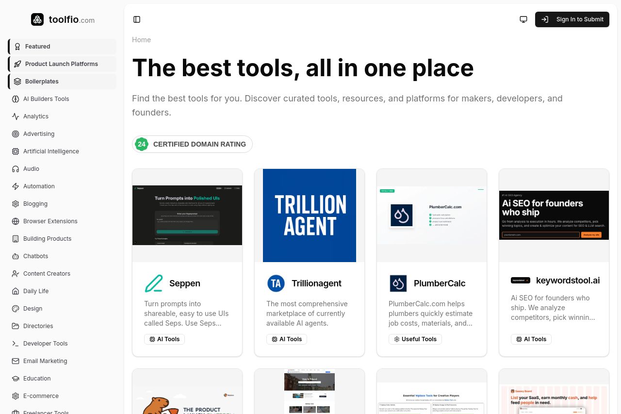
The landing page manages to present a wide array of tools in a simple grid layout, which is straightforward but lacks an engaging introduction. It's visually clean but almost too minimal, leaning towards bland rather than sleek. The headline "The best tools, all in one place" is a classic cliché and doesn't provide a unique selling point. The supporting text fails to captivate the audience—plainly stating benefits without any hook.
The sidebar navigation is rather overwhelming with its long list, though it categorizes the tools effectively. CTAs are poorly highlighted and blend with the rest of the content, lacking emphasis. The design is consistent in style, which is a plus, but offers no differentiation for critical elements like CTAs. Trust elements like featured badges in the footer are small and not immediately attention-grabbing.
- Enhance the main headline with a unique selling proposition that clearly differentiates your platform.
- Make CTAs more prominent with contrasting colors or unique button shapes to attract attention.
- Add dynamic or interactive elements to engage visitors and break the monotony.