moleskine.com
Landing Page Analysis
Discover all our collections from notebooks and planners to backpacks. Start to create your own story with Moleskine.
Summary:
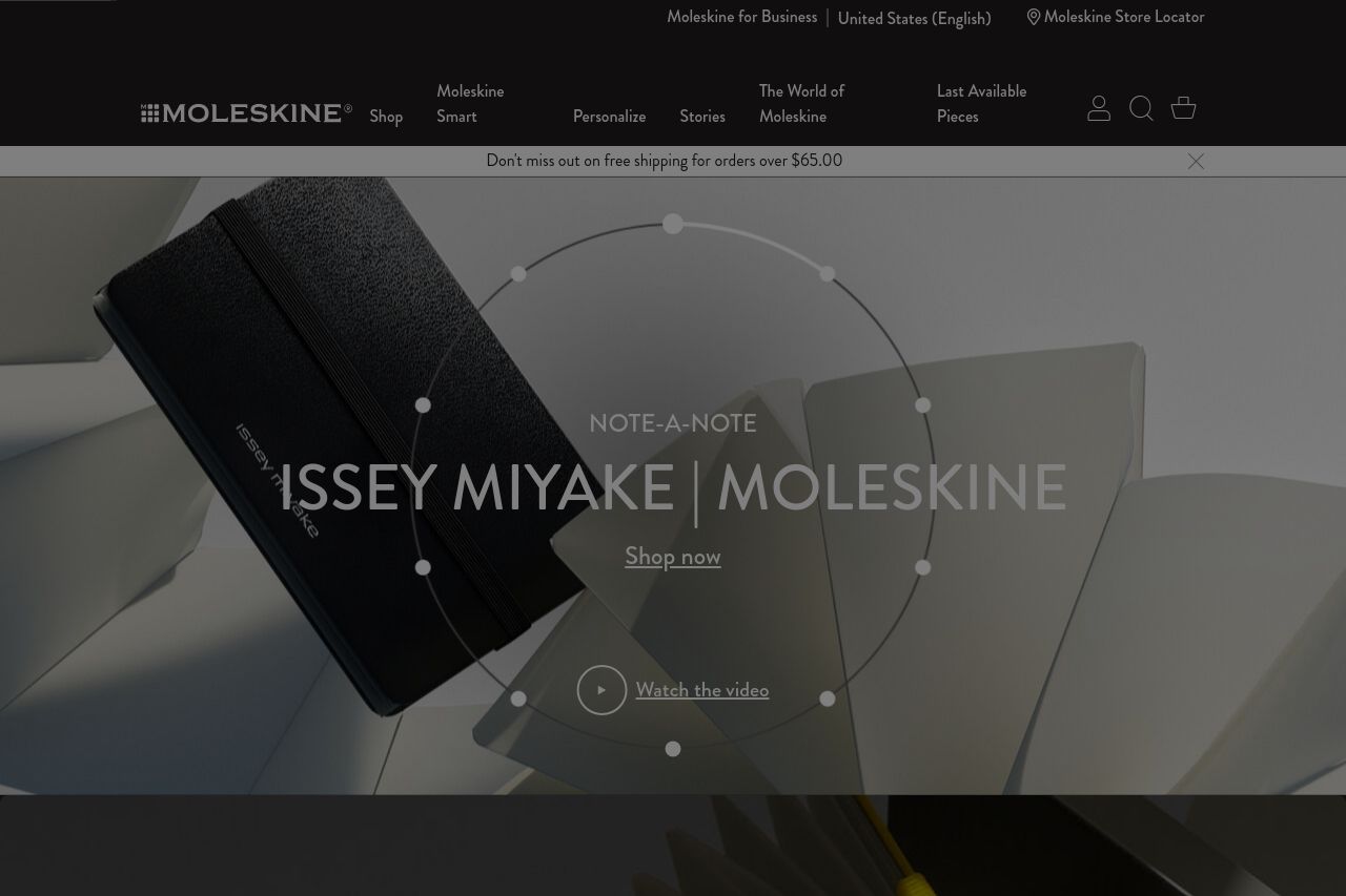
The landing page has a sophisticated design but lacks in multiple areas which could be crucial for conversions. The imagery is strong, reflecting the brand's artistic focus; however, the messaging is vague and pretentious—phrases like "an impression of the Impressionists" feel artsy but are not functional for a shopping experience. The numerous collections are highlighted, but there’s an overload of sections and ideas without strong guidance for users. The CTAs are abundant yet not very compelling or clear, simply saying "Shop the collection" without instilling urgency or offering real incentives.
While visually appealing, the hierarchy isn’t optimal as important information such as benefits or unique selling points are buried under a wave of aesthetics. The constant cookie warnings are intrusive and could distract the user. While the site is undoubtedly professional in appearance, it fails to leverage social proof effectively, other than relying on the known brand name. The tone may connect with fans of the brand, but it might alienate or confuse new customers.
- Simplify and clarify the value proposition with less abstract text.
- Enhance CTAs with more action-oriented language and scarcity.
- Reduce distractions from cookie banners or tone down their prominence.