upigeo.com
Landing Page Analysis
seo.pages.home.description
80
Share on:
Summary:
70
Messaging
60
Readability
85
Structure
65
Actionability
80
Design
100
Credibility
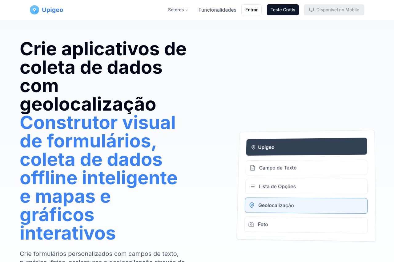
The landing page for Upigeo has good structure and messaging but could use improvements in actionability and readability. The value proposition is clear, explaining how the product aids in data collection with features like geolocation and offline access. Social proof is robust with testimonials and client logos, enhancing credibility. However, the CTA placement and differentiation could be enhanced. The overall design is clean, but some sections feel text-heavy, possibly impacting engagement. Consistent use of typography ensures readability, yet some jargon and complex sentences require addressing.
Main Recommendations:
- Enhance CTA differentiation with more contrasting colors.
- Simplify and break down text to enhance readability.
- Improve Open Graph data to be more descriptive and clickable.