finara.dk
Landing Page Analysis
Finara - din betroede partner inden for revision, regnskab og økonomisk rådgivning. Vi hjælper virksomheder med professionel revision & bogføring
Summary:
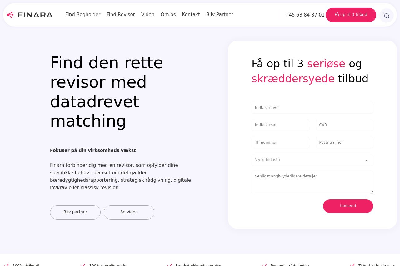
The landing page for Finara is quite functional but has room for improvement. The value proposition is clear from the start, focusing on data-driven matching for finding accountants, yet it lacks specific examples and targeted messaging tailored to accountants and bookkeepers. The design feels consistent with professional touches, but visual hierarchy could be enhanced to make the CTAs more prominent. Readability is decent, though text simplicity needs work as some parts come off as a bit lengthy. Open Graph data could capture more attention with a bolder image, and the image could be less conventional. There's a good attempt at credibility with testimonials, yet expanding social proof through more visible client logos would be beneficial.
- Add specific examples or use cases in the value proposition.
- Improve the visual hierarchy by making CTAs more prominent.
- Simplify text and use clearer, targeted language.
- Increase social proof with more visible client logos.