com.au
Landing Page Analysis
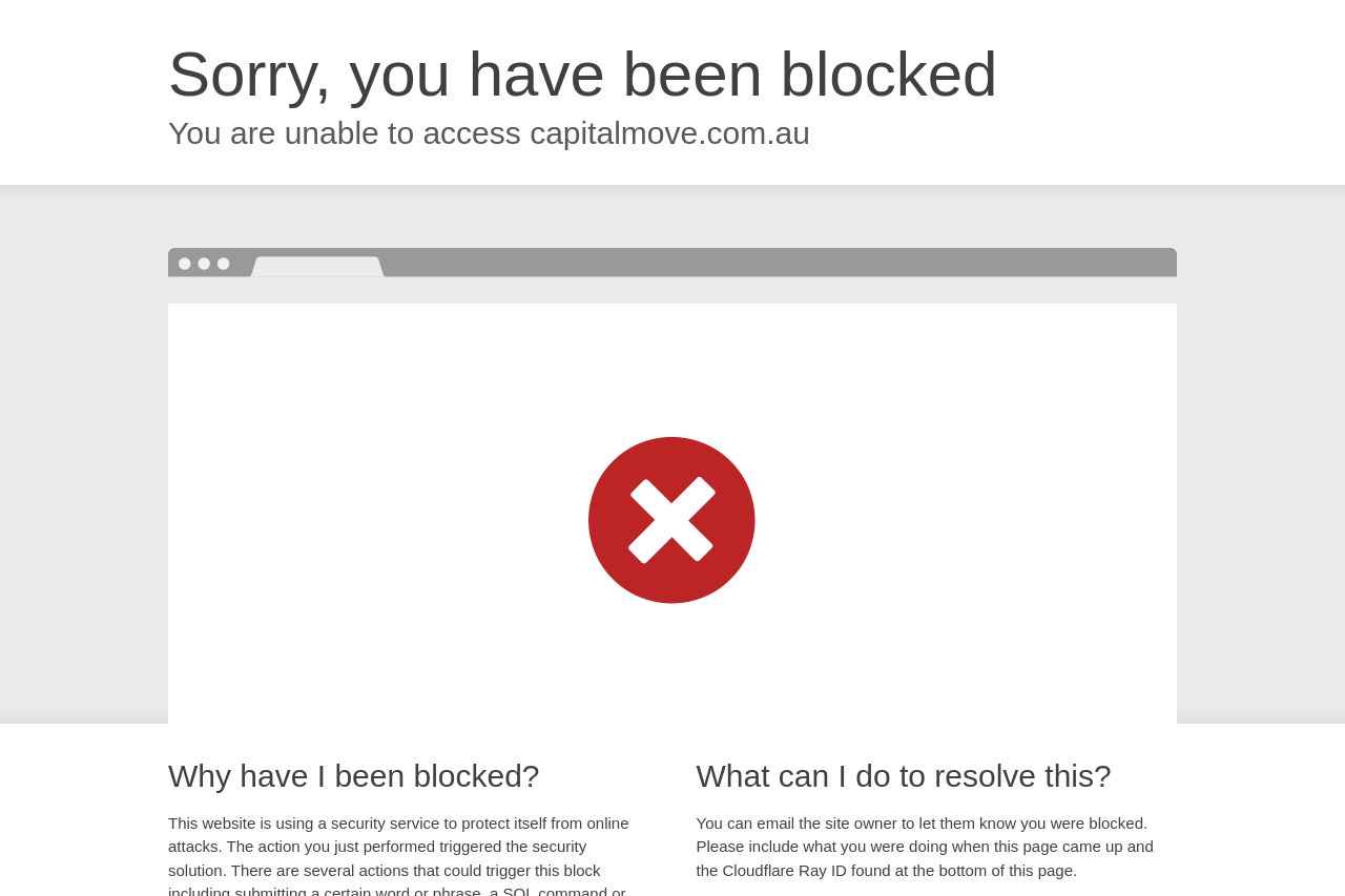
This website is using a security service to protect itself from online attacks. The action you just performed triggered the security solution. There are several actions that could trigger this block i

Summary:
Huge miss right off the bat! No title or description means you're not communicating anything. This is a critical lane for first impressions, and right now, it's an empty highway. There's literally nothing inviting or engaging, leaving visitors with no clue about what's behind the curtain. This creates a huge trust gap. Without even a basic image, you're losing out on a visual opportunity to grab attention and provide context.
It's like showing up to a networking event with no business cards or name tag. Missed opportunity to convey brand presence and value right from the start. Your audience is in the moving process; they want to know you're there, ready to help. But you’re nowhere to be found.
The friction from the blocking page adds an extra layer of annoyance. Plus, users aren't likely to jump through hoops just to find out more about you—they'll just move on to the next option.
- Ensure the website has a functioning landing page accessible to users to avoid immediate distrust.
- Implement a clear and engaging title and description for the website to communicate purpose and value.
- Incorporate at least one relevant image to capture interest and enhance the visual appeal.