amazonaws.com
Landing Page Analysis
Jyotish GPT
Summary:
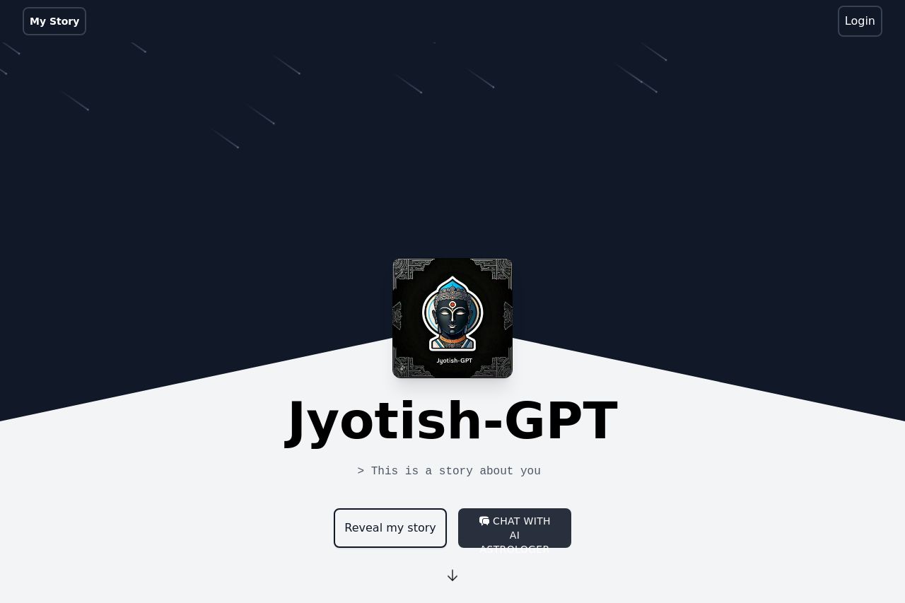
Jyotish-GPT's landing page is both visually striking and sparse on information. The minimalist approach with the dark theme provides a mystical ambiance appropriate for astrology, however, it lacks depth and clarity. The main call-to-action "Reveal my story" is prominent, yet there is a noticeable lack of explanation about what the user will gain or why they should engage further. The absence of detailed text or examples leads to ambiguity in understanding the true value of the service. While simplicity can be effective, here it translates to omission rather than clarity, leaving too many questions unanswered. The birth chart entry section is orderly but doesn't do much to guide the user. There's potential in the design, but execution falls short by not providing compelling reasons to proceed.
- Clarify the value proposition right at the start to engage the user more effectively.
- Include information or previews about what 'Jyotish-GPT' offers to build interest.
- Add social proof such as testimonials or reviews to build trust.