vcdir.com
Landing Page Analysis
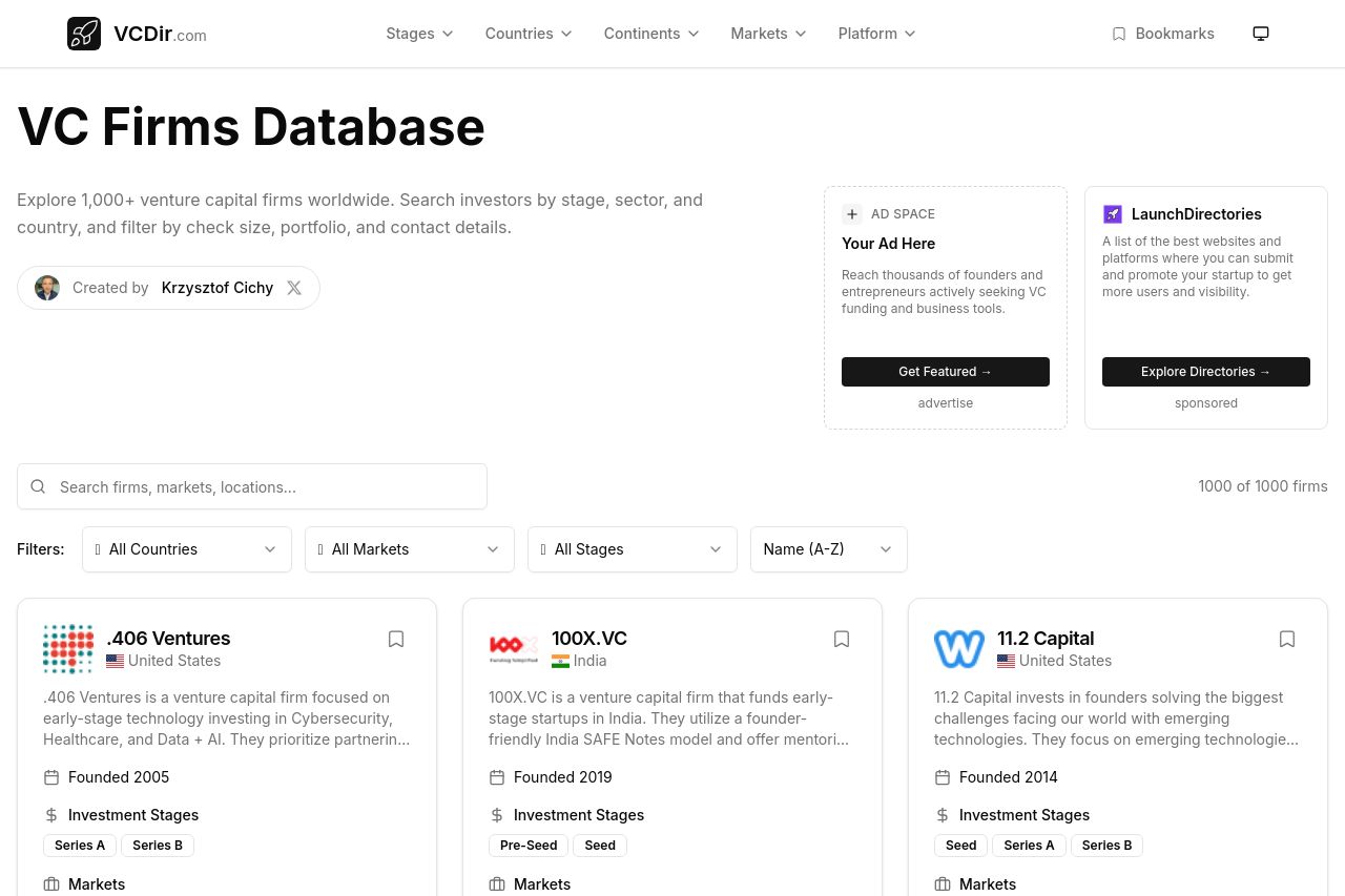
Comprehensive database of venture capital firms worldwide. Find VCs by country, investment stage, and market focus. Connect with investors for your startup.
Summary:
The website's structure is quite functional, providing a useful directory for venture capital firms, but it severely lacks in visual appeal and engaging messaging. The color scheme is bland and repetitive, which makes it hard for key elements like CTAs or headings to stand out. The overall design is consistent, yet feels uninspired and lacks contrast, leading to a dull user experience.
The main value proposition is somewhat clear, yet doesn't entirely communicate the uniqueness or benefits of using this database over others. The messaging fails to excite or engage the audience — it reads as flat and generic. The readability is somewhat good, though some text is too uniform, making it less impactful or memorable.
There's a solid application of filters and sorting methods for convenience, but nothing truly stands out to capture the audience's attention or compel them to take action immediately. Credibility is on the right track with the mention of various companies, but could be reinforced with more visual testimonials or recognition badges.
- Add stronger visual hierarchy with font sizes and color contrasts to highlight key information.
- Improve the messaging to be more engaging and specific about the platform's unique benefits.
- Incorporate more attention-grabbing design elements to make the CTAs stand out.