toolfio.com
Landing Page Analysis
Find the best tools for you. Discover curated tools, resources, and platforms for makers, developers, and founders.
Summary:
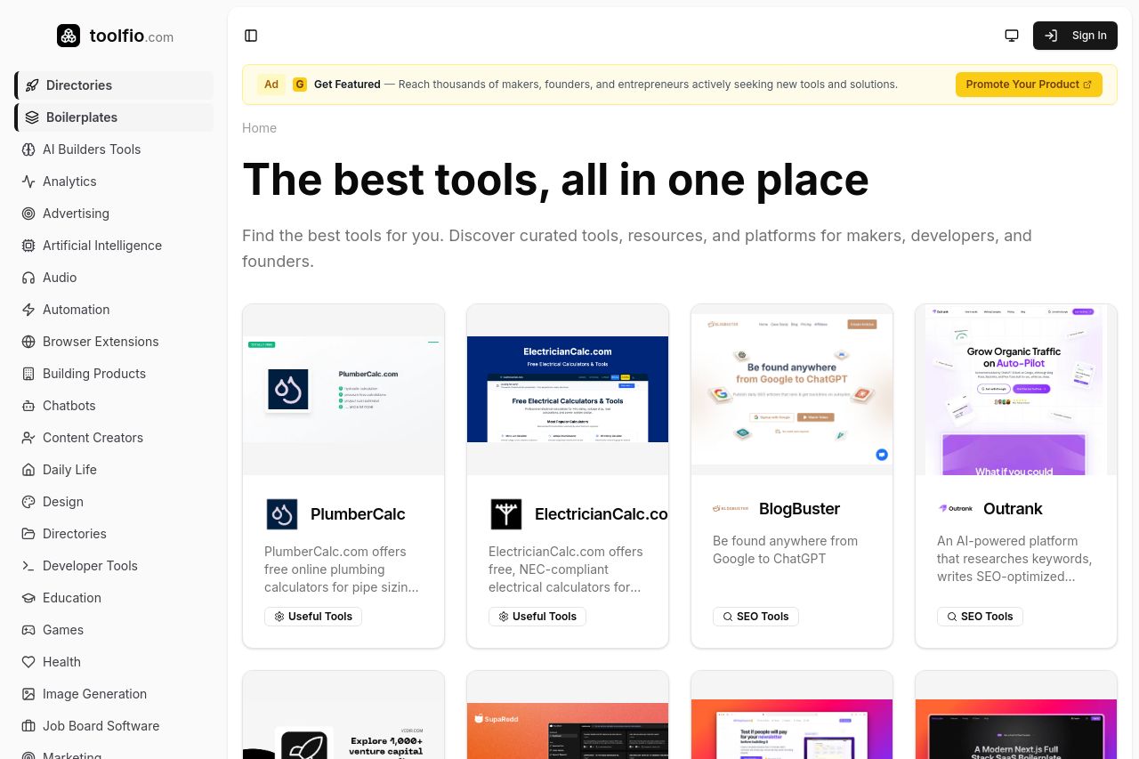
The landing page for Toolfio aims to provide a hub for various tools but leaves room for improvement in messaging and design. The headline, "The best tools, all in one place," is engaging, yet lacks specificity about what makes these tools valuable or precisely who they are for. The visual design and layout are clean, but overly simplistic and generic, losing out on opportunities to make important content stand out. The categories on the left provide navigation, yet the monochrome design could make it monotonous after some time.
There's a decent attempt at showcasing the tools with images accompanying each description, but the "Learn More" experience feels mechanical and uninspired. The CTA "Get Featured" stands out in yellow, which is good, but the layout doesn't seem to guide the eye naturally towards any specific action. Credibility attempts are fairly hidden in the footer, with small trust icons and vague language. The overall look gives a somewhat professional vibe, yet there's a risk of appearing generic with the standardized card format for tools.
- Enhance the main headline to specify why these tools are the best and who exactly benefits.
- Improve visual hierarchy using varied font sizes and weights to guide user focus.
- Make use of more vibrant colors or contrasts to break the monotony and highlight key actions.
- Add more engaging examples or previews of the tools to support text descriptions.
- Enhance the footer by surfacing credibility elements higher up on the page.