bolt.new
Landing Page Analysis
By signing in, you accept the Terms of Service and acknowledge our Privacy Policy.

Summary:
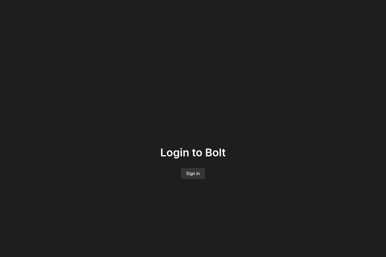
The page has a clear and straightforward structure but lacks depth in its presentation of features. There's the bare minimum in terms of content, which means many users might leave without fully understanding the product's capabilities or benefits.
While the design is clean, it almost feels too minimalistic, leading to a loss of visual engagement. Significantly, there are hardly any standout graphics or images to break up the monotony. The most pressing issue, however, is the lack of effective call-to-action elements across the site; they just don’t stand out enough. CTAs blend into the background, potentially leaving users unsure of the next steps.
On a more positive note, the layout is easy to follow due to its simplicity. Despite its flaws in engagement, let's not overlook the impeccable grammar and professional design of the page, keeping it from looking unprofessional. The structure is solid, ensuring all important information is readily accessible without requiring unnecessary clicks.
- Enhance CTAs by making them more visible and action-oriented, such as changing their color to a more conspicuous one like blue.
- Incorporate more graphics or visuals to break up the text and maintain user interest.
- Add detailed feature sections to elaborate on the product's functionalities.
- Improve the messaging by explicitly mentioning who the target audience is.