lovable.app
Landing Page Analysis
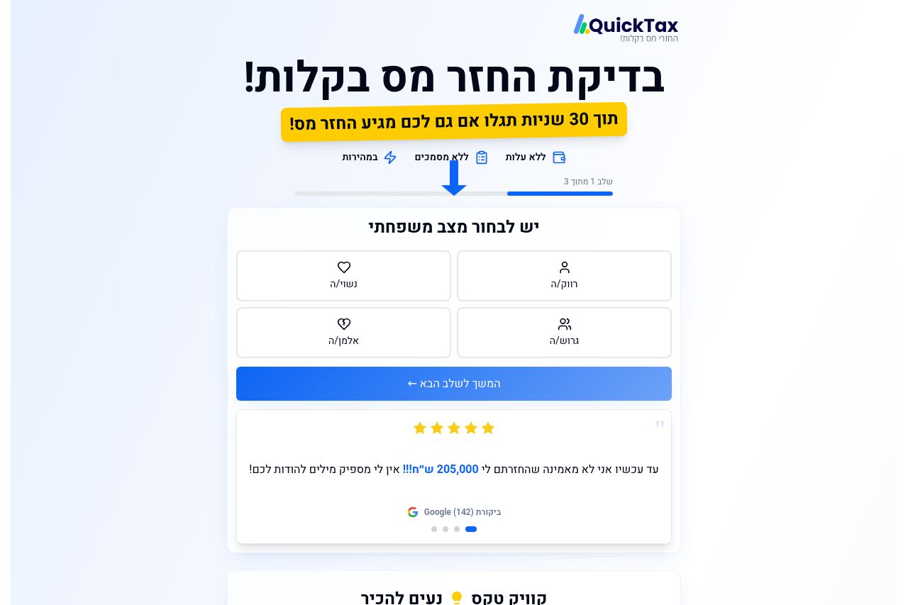
בדיקת החזר מס מהירה ללא עלות
73
Share on:
Summary:
70
Messaging
60
Readability
65
Structure
70
Actionability
75
Design
80
Credibility
The landing page does a decent job of presenting the core service—tax returns with ease. The visual hierarchy is reasonably clear, thanks to bold headings and a straightforward use of contrasting colors. However, the page struggles with information density and clutter, especially in the sections that explain the service's steps and benefits. The testimonials and ratings are a strong point, adding credibility. Still, the text is sometimes too lengthy and could benefit from further simplification to enhance readability. The CTAs are visible but lack emphasis and urgency, which could impede user action.
Main Recommendations:
- Simplify text and use bullet points for clarity.
- Enhance CTA buttons for more emphasis and urgency.
- Reorganize content to reduce clutter and improve flow.