co.il
Landing Page Analysis

Summary:
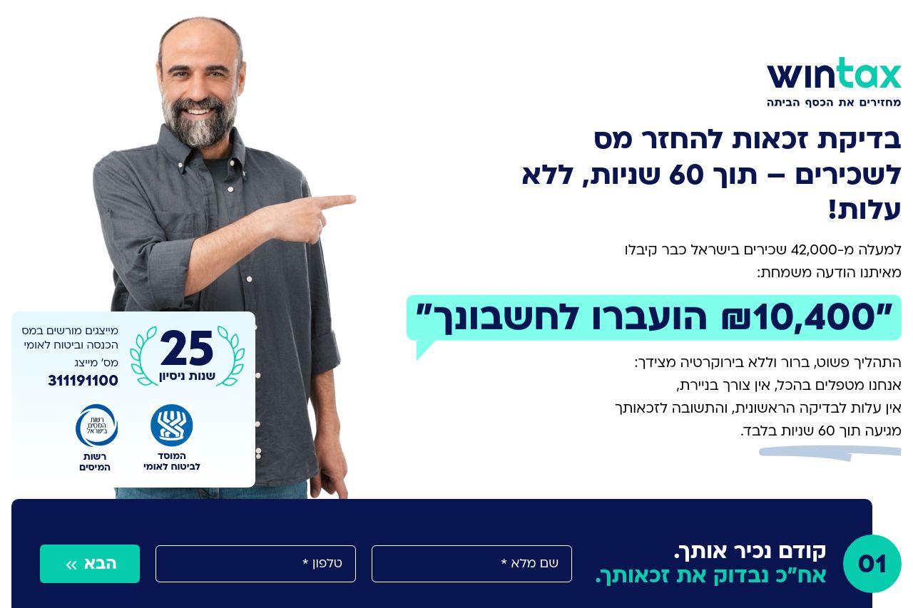
The landing page for Wintax remains functional but misses opportunities for a more impactful user experience.
Strengths: Clearly stated value proposition and good use of testimonials. The presence of trust elements helps build credibility. Social proof and the video content add richness that's often lacking in similar pages.
Weaknesses: The visual hierarchy could be improved. The CTAs, while relevant, lack dynamism and could benefit from more prominent placement. Information is a bit dense, and brevity would serve to keep readers engaged. The color scheme adds some interest but fails to guide the eye efficiently across the content.
Overall, the page does a decent job presenting its offering but still leaves plenty of room for improvement in terms of design, readability, and actionability.
- Enhance CTA design and placement for better visibility.
- Improve visual hierarchy to guide user focus more effectively.
- Streamline text to enhance readability and engagement.