wrteam.in
Landing Page Analysis
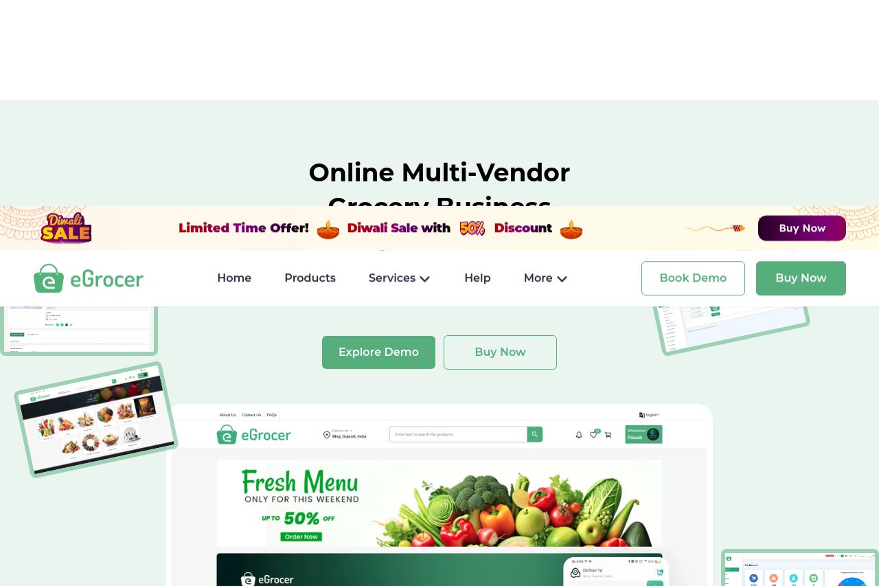
Start your multi vendor grocery delivery store with eGrocery. A Flutter app with Laravel admin panel, source code, and grocery store website template—perfect for on-demand delivery and ecommerce marke
Summary:
The landing page does well in showcasing the product with clear visuals and descriptions of features. However, it's overloaded with repeated calls to action like "Book Demo" and "Buy Now," which creates confusion. The design is visually appealing with consistent color schemes and good typography. The target audience is fairly broad but decently addressed through textual elements. Social proof is present but lacks impact due to generic testimonials. Readability is compromised by overloaded graphics and excessive pop-ups at the bottom right, which distracts from the content. Headings and features are clearly divided but lack memorable impact due to monotony in presentation. Credibility elements like icons for technological foundations give it a professional touch, yet the pricing table is too basic and requires more emphasis on differentiators between plans.
- Reduce the number of CTAs to avoid confusion.
- Enhance testimonials with more impactful and specific customer stories.
- Revamp the pricing page to highlight differentiators effectively.