elevatesells.com
Landing Page Analysis
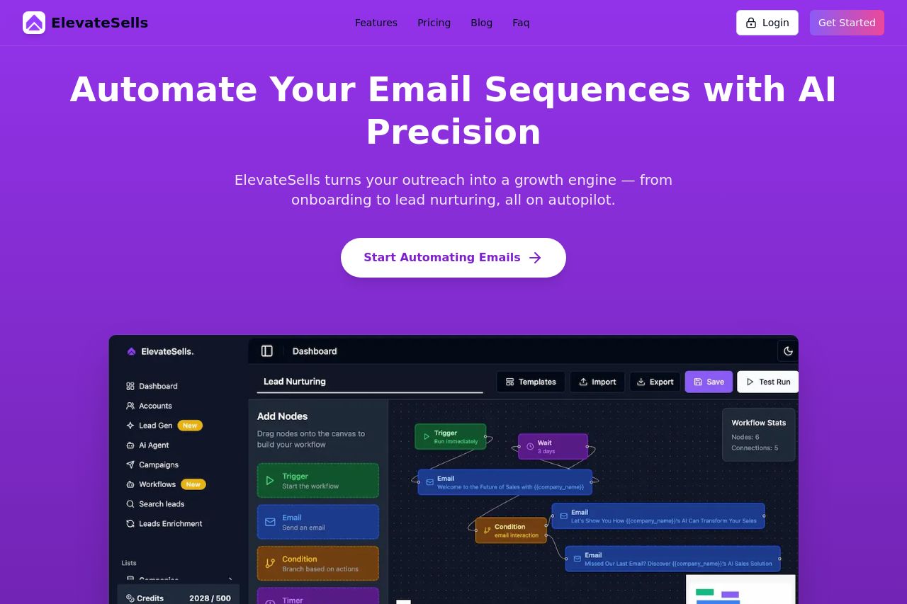
Automate personalized email sequences with ElevateSells — from onboarding new customers to nurturing leads and following up after events. Boost engagement, save time, and scale outreach with AI.
Summary:
The landing page for ElevateSells does a decent job of communicating its core offer, which is automating email sequences with AI. The hero section effectively highlights this value proposition by using a strong headline and a clear call-to-action button. However, some elements could use work. The color palette, while distinctive, could feel overwhelming with extensive purple and does not provide much contrast. While the features are laid out in a somewhat logical fashion, it could be more impactful with clear, personalized example scenarios or testimonials, especially considering how crucial they are for credibility. The overall tone is professional yet approachable, fitting well for a SaaS audience. But, there might be a bit too much assumed knowledge, which could alienate those new to email automation tools. Visual hierarchy and structure throughout are generally good but still leave room for improvement in guiding users more intuitively through the content.
- Consider breaking up dense text with more visuals or bullet points to enhance readability.
- Add customer testimonials or case studies to increase credibility and connect with potential users.
- Use a more varied color palette for better visual hierarchy and engagement.