webposonline.com
Landing Page Analysis
WebPOS Panamá - Proveedores PAC Factura electrónica,Proveedor de Autorización Calificado
Summary:
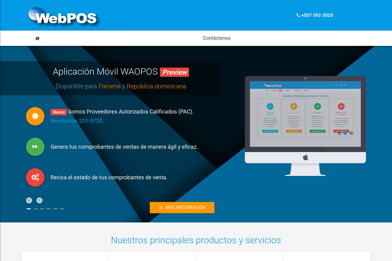
WebPOS has a decent attempt but leaves much to be desired. The hero section tries to communicate the application offering, but it's rather cluttered and lacks a strong hierarchy. The call-to-action button is visible but just says "Más Información," failing to be enticing or clear on what the user gains. The features section does a better job of presenting the offerings but is visually uninspired.
The color scheme and typography need work. The blue and orange clash, and there is a lack of cohesion across sections. Text readability suffers due to font size issues; some parts are unnecessarily small and hard to read.
Structure-wise, it's mildly disorganized. While it manages to present some information clearly, it doesn't logically follow a user journey. The footer is packed with contact details and links that feel almost lost in the overall design.
Social proof elements exist in the logo area but are not compelling.
- Enhance the CTA with specific action-oriented language, e.g., "Explore Features Now."
- Refine the color scheme to ensure better contrast and cohesion across the site.
- Improve visual hierarchy for better readability and user guidance.