onetreedb.com
Landing Page Analysis
Centralize agricultural research workflows with OneTree. Coordinate trial documentation, analyze data, and share performance insights with growers in real time.
Summary:
The landing page for OneTree attempts to deliver a clear message but falls short on several key aspects.
The value proposition "Centralize your research & development" tries to clarify what the product does but lacks punch and explicit benefits at first glance. More clarity is needed to truly capture interest quickly. While the detailed explanation below does help, it shouldn’t take digging to get the main idea.
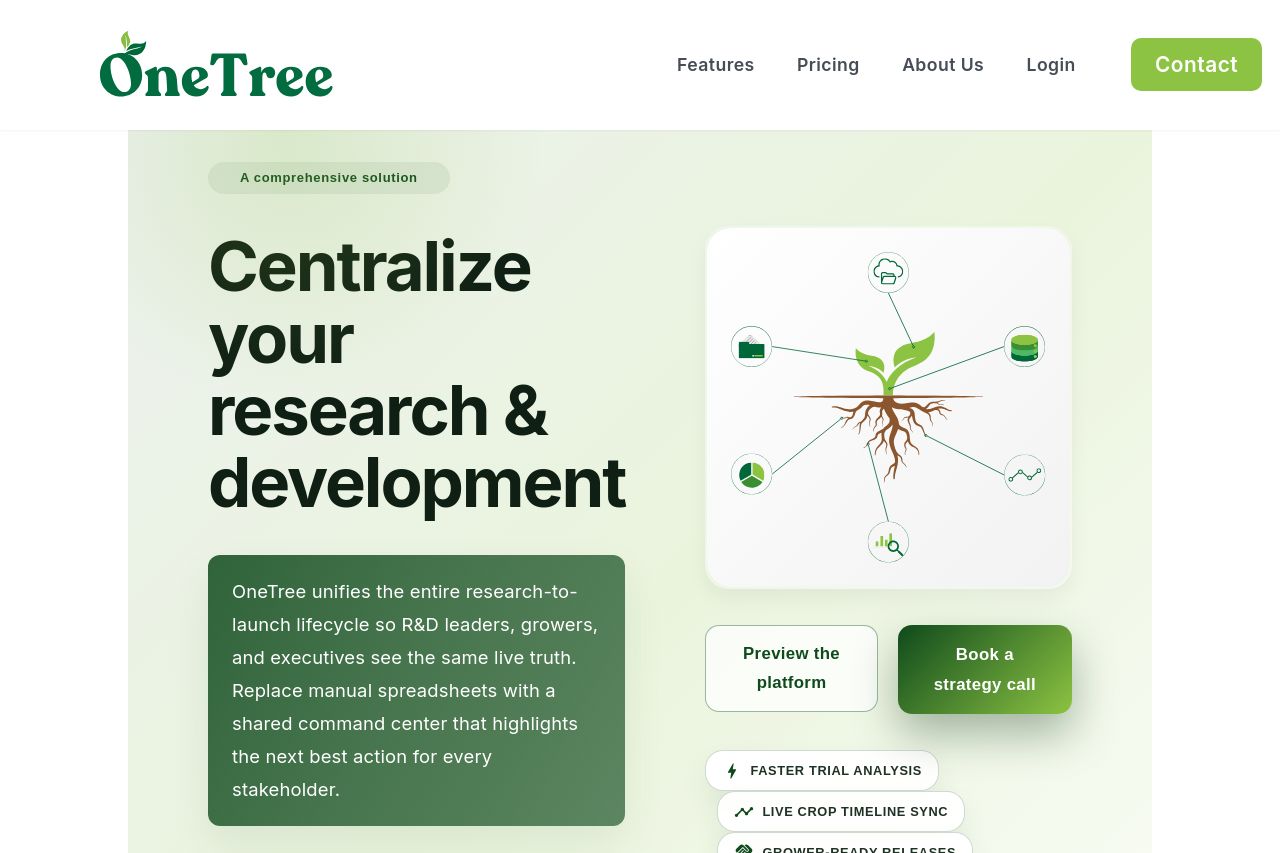
Visual elements such as the illustration and buttons are well placed but don't pop enough. The buttons are quite faint, lacking contrast to really grab attention. The imagery might be a bit too abstract without supporting text directly tied to it.
The overall design feels cohesive, yet the typography and color contrast are not exploited enough to enhance readability. Text blocks are decently sized but could benefit from more hierarchy.
Social proof or credibility elements are completely absent - a huge oversight that undermines trust. Including client logos or testimonials could enhance credibility quite a bit.
Call-to-action buttons like "Preview the platform" and "Book a strategy call" are clear but need better visibility and prominence in the design. Proper placement is crucial for guiding users.
- Strengthen the value proposition headline to be more attention-grabbing and clear.
- Increase the contrast of call-to-action buttons for better visibility.
- Incorporate social proof elements such as testimonials or logos from existing clients.
- Use typography variations to create a stronger visual hierarchy and improve readability.