myrecipefy.com
Landing Page Analysis
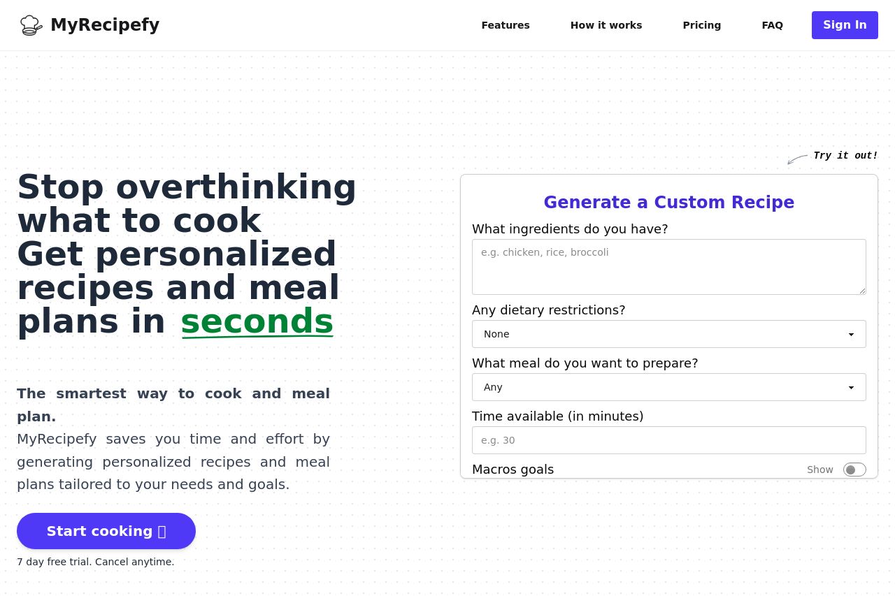
Instant personalized recipes and mealplans based on your ingredients and lifestyle.
Summary:
The landing page for MyRecipefy does a decent job in terms of visual design and clarity, but there are significant areas needing improvement in messaging and actionability. The value proposition is obscure at first glance, as it gets lost in the overall presentation and lack of clear communication. While the layout isn't a complete disaster, it's a bit lackluster in guiding the user to take action swiftly. The contrast between colors isn't bad but could utilize more contrast for a visual pop where required. The typography is actually quite basic and readable, which helps mitigate some design issues. However, the consistency in tone and the language could really benefit from being more engaging and specific to reach the intended audience. Social proof is glaringly absent, leaving potential users without trust cues to rely upon. While the information flow is decently structured, the lack of more in-depth content let's it down further. Clear calls to action are nearly impossible to find in the murky depths of the page. Overall, the site could benefit from a more compelling message, social proof, and clearer calls to action.
- Strengthen your value proposition to make it clear and instantly understandable.
- Add social proof like testimonials or reviews to increase credibility.
- Make your CTAs more prominent and action-oriented.