conversioncruise.com
Landing Page Analysis
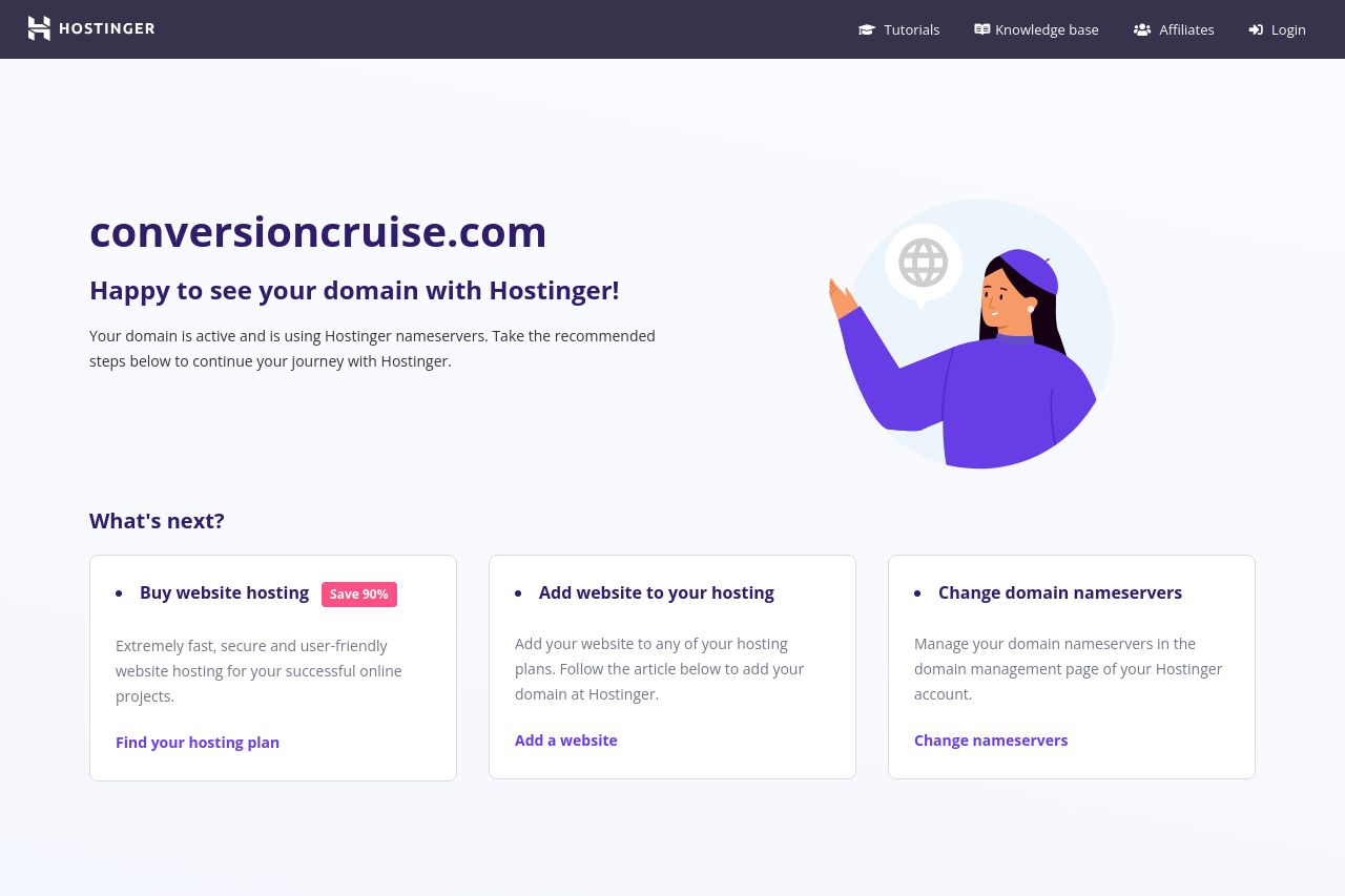
Parked Domain name on Hostinger DNS system
Summary:
This landing page feels more like a welcome page for existing customers rather than a conversion-focused landing page. The headline, "Happy to see your domain with Hostinger!" does not convey a compelling value proposition or reason for a visit, especially for potential new customers.
The page design is simple but lacks strong visual appeal or strategic elements to guide visitors' attention toward specific actions, like purchasing or learning more. The CTAs are present, but they lack urgency and stand out due to their small size and unengaging phrasing.
There's a missed opportunity to include social proof or demonstrate benefits of the service. The layout is too ordinary and lacks critical engagement elements like customer testimonials, compelling imagery, or a unique selling proposition.
Overall, the page serves a very straightforward purpose with minimal effort to engage or convert visitors into active customers.
- Add a clear and compelling value proposition up top.
- Improve CTAs to be more action-oriented and engaging, e.g., "Boost Your Site - Save 90% Now!"
- Include social proof or testimonials to build trust.
- Enhance the design with more visually appealing elements like images or icons.
- Incorporate benefits-focused language to connect with the target audience.