naruflow.com
Landing Page Analysis
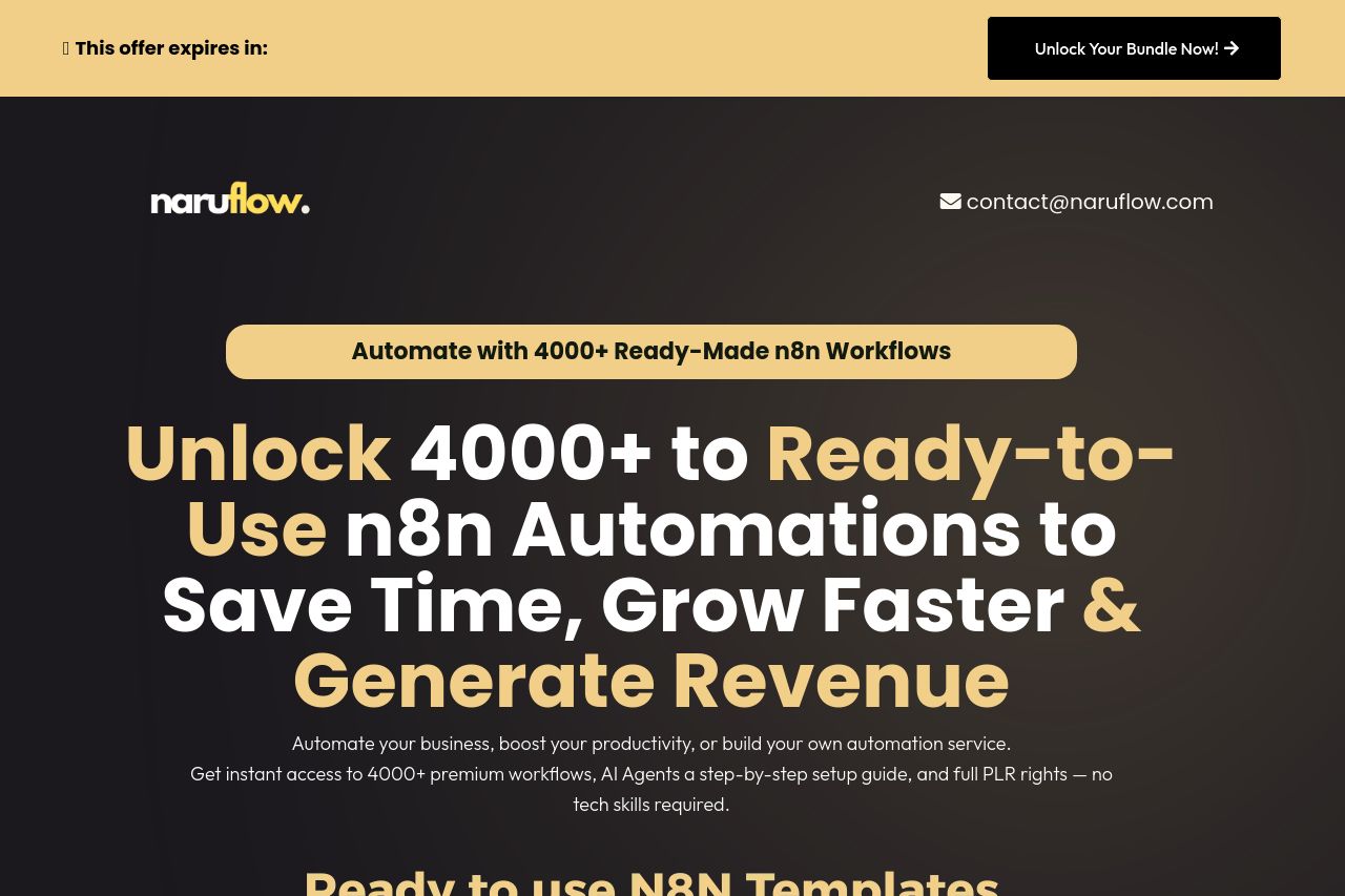
Automate your business, boost your productivity, or build your own automation service.
Summary:
The landing page has a strong focus on presenting its offer—4000+ ready-made n8n automations. The use of contrasting colors with bold fonts effectively highlights key points, although the overall visual hierarchy can feel overwhelming in places. The call-to-action (CTA) buttons are well-placed and consistent throughout, but they could stand out more.
While the message is clear and benefits are boldly stated, the tone is almost too aggressive, pushing urgency with the countdown timer. This could frustrate potential buyers rather than entice them. Social proof, like testimonials and reviews, are present, which enhances credibility. However, these might benefit from more detailed, genuine stories.
Readability suffers slightly with heavy blocks of text in certain sections, making it hard to skim. Using bullet points strategically helps, but some paragraphs can be more concise. The design is cohesive and professional, but a bit too busy, which might distract from the main message.
- Enhance the visibility and visual appeal of the CTA buttons to draw more attention.
- Decrease the reliance on urgency techniques, as they can detract from user trust.
- Simplify and streamline text blocks for improved readability and engagement.