https:lunarkal.click
Landing Page Analysis
📧contact@lunarkal.click
69
Share on:
Summary:
70
Messaging
60
Readability
55
Structure
55
Actionability
70
Design
85
Credibility
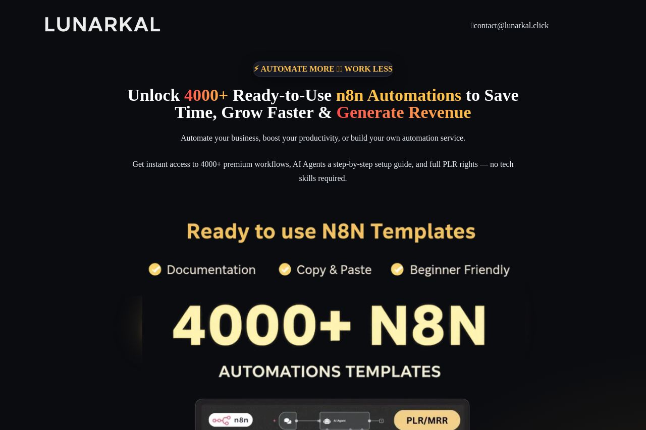
The landing page for Lunarkal's n8n automations has a strong visual appeal with a consistent color scheme and effective use of contrasting text to highlight key points. The main value proposition is clear, showcasing over 4000 automations, but the repetition of price and value claims may overwhelm newer visitors. The inclusion of bonuses is enticing but feels excessive and could be streamlined for clarity. Social proof is effectively integrated with testimonials and ratings, which builds trust. However, the navigation could be more intuitive, and the multiple CTAs can be a bit disorienting. The benefits might get lost in all the information, necessitating a simpler structure to maintain focus.
Main Recommendations:
- Simplify the structure and reduce repetitive elements to enhance clarity.
- Enhance navigation by differentiating sections more clearly with headings.
- Focus CTAs to prevent distractions and improve the user journey.