bodyvisualizer.org
Landing Page Analysis
Body Visualizer helps you transform your body with AI-powered 3D visualization. Set fitness goals, track progress, and achieve your ideal body shape with scientific precision.
Summary:
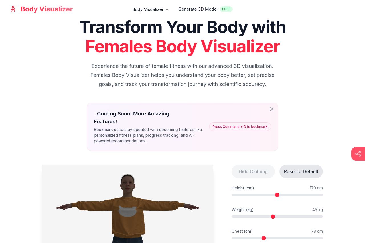
The landing page for "Females Body Visualizer" straddles the line between functional and forgettable. It's sporting a clear, bold headline that communicates its purpose, but dives straight into a sea of generic, eye-glazing text. The 3D model is intriguing and interactive, giving a hands-on experience right away, which is an impressive feature. However, the design and messaging could use some serious tightening up. The color scheme and layout lack a hit of sophistication, and the visual hierarchy feels pedestrian at best. Information feels scattered, with supporting details failing to build a cohesive narrative. The site attempts to gain credibility but crashes by oversaturating the page with unrelated tools and friend links in the footer. This is not adding any value to the landing page whatsoever and instead distracts from the main message.
- Streamline the color and text consistency to bolster visual clarity and hierarchy.
- Refine the body of text to be more engaging and specific to the audience.
- Reorganize elements for better information flow and user navigation.