webnovelai.io
Landing Page Analysis
WebNovel AI helps you structure your web novel from concept to chapters. Build webnovel worlds, design characters, and draft your web novel story.

Summary:
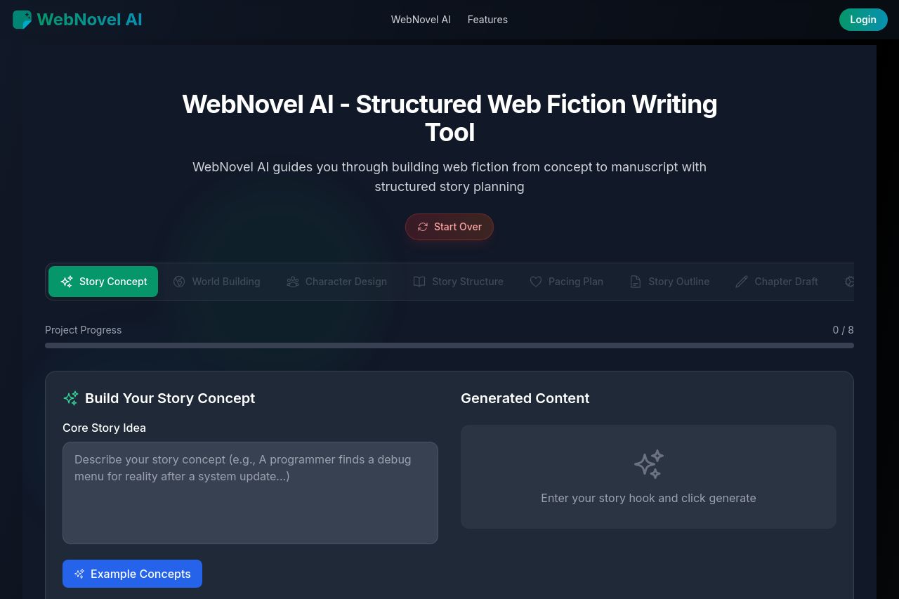
Overall, the landing page for WebNovel AI delivers a coherent and professional first impression. The page's dark theme is consistent and gives it a polished look. The value proposition is clear, focusing on helping authors from concept to manuscript, which is well-targeted to its primary audience.
The sections flow logically, with clear headings and information that builds from introduction to deeper features, enhancing user understanding. However, the excessive repetition of the cookie notice is overwhelming, detracting from the user experience, although the use of bold green and blue colors for CTAs effectively draws attention.
The design is visually appealing, using contrasting colors and sharp images to aid in comprehension. Despite this, some text blocks are dense and appear intimidating, which can hinder readability. The CTAs are action-oriented and engaging, yet their placement could be optimized for better conversion.
The testimonials add credibility to the platform, but the monopoly of teal and blue without much deviation results in monotony. Additionally, the privacy policies are extensive but might be off-putting due to lack of transparency in accessibility.
The Open Graph data is decent but could be spiced up with more intriguing text to spark curiosity. The current image doesn't add enough context or allure to capture users' attention effectively.
- Introduce more color variation to avoid monotony.
- Improve the visibility of testimonials by integrating more visual elements.
- Enhance CTAs' placement after key sections and reduce cookie notices.