glendaleschool.org
Landing Page Analysis
Explore top-tier Cambridge and IGCSE school admissions in Hyderabad at Glendale. We offer a globally recognized Cambridge IGCSE curriculum, expert academic support, and a seamless admission process. E
Summary:
Overall, the landing page does some things right but falls short in key areas that could really elevate its effectiveness.
The messaging is somewhat effective, with attempts to highlight the institution's unique offerings, but it lacks clarity and punch. The value proposition is vague and overly wordy, missing a concise expression of what makes this school stand out.
Readability is generally solid with short paragraphs and a reasonable amount of white space, but the text is somewhat jargon-heavy and could benefit from simplification for busy parents who skim rather than read in detail.
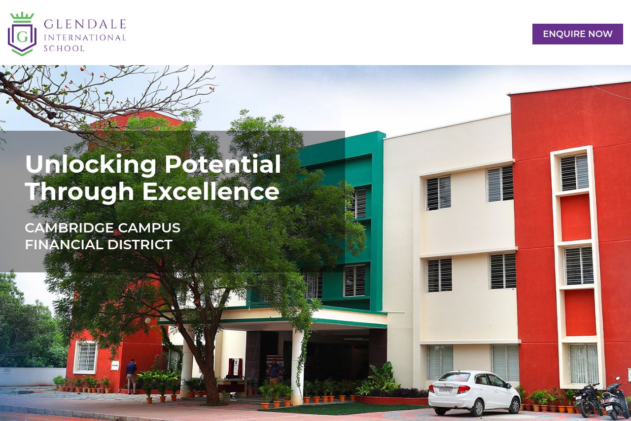
Design-wise, the page uses consistent colors and fonts, but the visuals could be stronger. Icons are neat but feel generic. The layout is not cluttered, which is good, but it doesn't truly grab attention or guide the user's eye effectively.
Structure presents key information prominently, but more emphasis on logical flow between sections would help the overall experience. A little more organization and fewer distractions would keep attention where it belongs.
Actionability is quite disappointing. The call to action buttons are present but not compelling. They lack urgency or any real call to action that makes the user want to click.
Finally, credibility is above average. The association with Cambridge and Global Schools Group suggests high standards, helping establish trust. However, more elements like testimonials could further enhance this.
In short, this landing page has a solid foundation but needs polish to truly shine. Clarifying the message, enhancing the design, and refining the call-to-actions would potentially lead to higher parent engagement and conversions.
- Simplify the language and make the value proposition more concise.
- Use more engaging visuals and real images of the school to capture attention.
- Improve the CTA with more urgent and compelling language.