com.au
Landing Page Analysis
18.0s
44
Share on:
Summary:
35
Messaging
58
Readability
40
Structure
30
Actionability
55
Design
30
Credibility
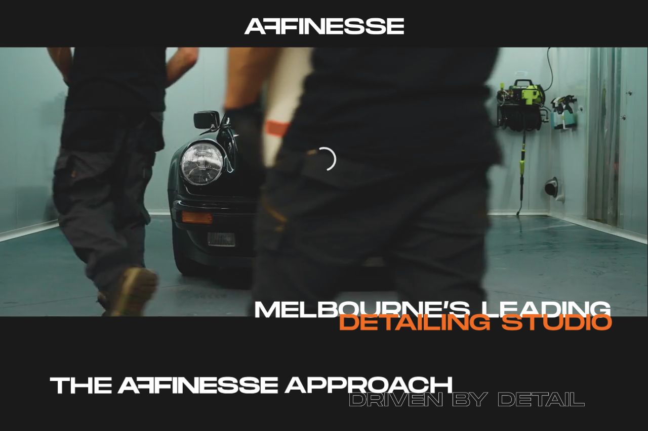
The landing page presents itself as a top-tier detailing studio in Melbourne but feels too vague. The hero section is strong with a dynamic image that suits the service. However, the messaging falters by being overly generic, leaving the user wondering about specifics. Visually, the design keeps things smooth but lacks the punch needed to grab attention. Readability could improve, with text bunched up and not enough contrast, making it a chore to scan through. Calls to action are absent, so the next step isn’t intuitive at all. The lack of testimonials and credibility badges makes it hard to trust whether they can live up to the claim of being "Melbourne’s Leading" in anything.
Main Recommendations:
- Improve value proposition with specifics like services offered.
- Add call-to-action buttons to guide user interaction.
- Incorporate testimonials or reviews for credibility.