write-it-down.com
Landing Page Analysis
Learn why writing things down boosts memory, productivity, and follow-through. Practical tips and FAQs.
Summary:
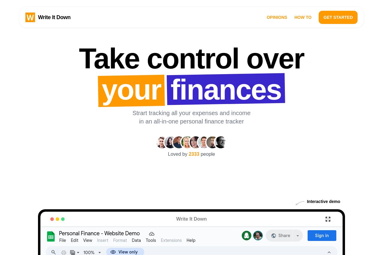
The landing page of Write It Down has a solid start with its clear and direct value proposition, inviting users to 'Take control over your finances'. The use of interactive elements, such as the Google Sheets demo, enhances engagement by showing the product in action. The page simplifies financial management by focusing on a few crucial features, making it seem approachable. However, there are issues with readability and structure. Some elements feel cramped, and the design could benefit from more uniformity. The testimonials add social proof, but more prominent visuals could help increase appeal. The pricing is clear with a call to action, yet the overall design feels slightly disjointed in sections. Enhancing visual clarity and aligning the design elements would improve the user experience.
- Increase visual clarity by using consistent color schemes and spacing.
- Improve the readability of some text by simplifying language and layout.
- Enhance the visual appeal of the testimonial section with more dynamic graphics.