wrteam.in
Landing Page Analysis
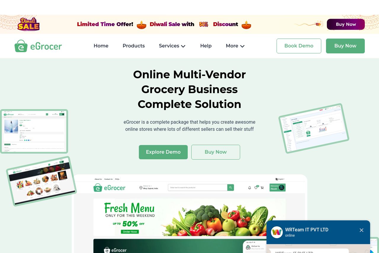
Start your multi vendor grocery delivery store with eGrocery. A Flutter app with Laravel admin panel, source code, and grocery store website template—perfect for on-demand delivery and ecommerce marke
Summary:
The landing page has a visually clean design with a consistent green and white color scheme that aligns well with its grocery e-commerce focus. The hero section effectively highlights the main value proposition. However, there's an overwhelming array of CTAs that could confuse users. The product features and benefits are listed but lack distinctiveness. Navigation is straightforward, yet the site feels cluttered due to frequent redundant elements like the chat box. Pricing details are clear, but the page doesn't emphasize product differentiation enough. Testimonials add credibility, but additional trust indicators such as more recognizable client logos could enhance trust.
- Streamline CTAs to avoid user confusion by reducing the number of call-to-action options.
- Enhance product differentiation by adding unique selling propositions to stand out from competitors.
- Improve trustworthiness by incorporating more recognizable client logos or case studies.