wrteam.in
Landing Page Analysis
Start your multi vendor grocery delivery store with eGrocery. A Flutter app with Laravel admin panel, source code, and grocery store website template—perfect for on-demand delivery and ecommerce marke
Summary:
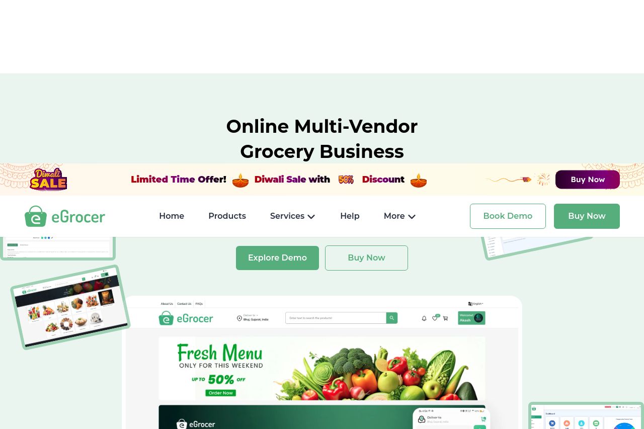
The landing page for eGrocer shows potential but fails to deliver in several crucial aspects. The main value proposition is laid out clearly as a multi-vendor grocery business solution, which is great for clarity. However, the overwhelming presence of CTAs like "Get Your Personalized Demo" and "Book Demo" dilutes their effectiveness due to repetition. The design is consistent, aligning well with the target audience, but becomes cluttered with excessive offers and an intrusive chat feature. The readability is decent, but text blocks, such as the timeline in "Save Money & Time With eGrocer Script," need visual hierarchy to guide the eye effectively. Despite clear sections, the site jumps around with mixed messaging that could confuse users rather than guide them seamlessly. Testimonials are present, boosting credibility, but the overall user journey lacks focus, especially with redundant CTAs.
- Reduce the number of repeated CTAs to avoid confusion.
- Enhance text hierarchy for better readability and flow.
- Consolidate messaging to avoid jumping between unrelated sections.