unaweb.net
Landing Page Analysis
Creamos sitios web, ecommerce y estrategias de marketing digital para ayudar a tu negocio a crecer y vender más. Solicita una cotización.
Summary:
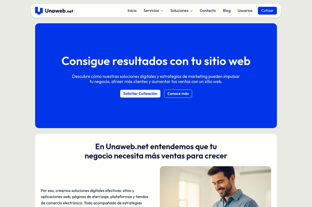
The landing page for Unaweb.net is decently structured but lacks some key punch in messaging and design. The value proposition is somewhat clear, indicating that the company aims to deliver results through digital solutions and marketing. However, the messages are generic and fail to stand out. The usage of the strong blue background in the hero section does draw attention, but the overall design feels monotonous and lacks dynamism. Typography is straightforward but doesn't enhance engagement, and the CTAs are present yet lack impact and urgency. The service details are presented clearly, but the use of imagery could be more compelling. Social proof and transparency elements, like contact details, are in the footer, adding a bit of trustworthiness. Overall, the site needs to push more energy into grabbing attention and encouraging conversions.
- Revamp the hero section to make it more visually engaging and clearly state benefits.
- Enhance imagery across the site to make it more appealing and memorable.
- Improve CTA visibility and urgency with more vibrant colors and compelling text.