waterpoint.dk
Landing Page Analysis
Din indkøbsvogn er tom
Summary:
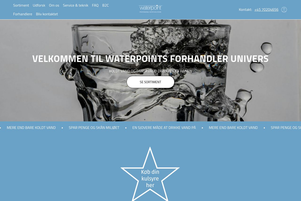
The Waterpoint landing page has some strengths, especially in its clear color scheme and consistent design elements that make it visually cohesive. However, it lacks in making the main value proposition crystal clear, failing to effectively communicate the core benefits and features that could attract potential customers. The imagery, while aesthetically pleasing, does not strongly support the messaging or provide any direct value context. The call-to-action (CTA) buttons, while present, don't stand out effectively enough, lacking urgency or strong action words that could drive conversion. Language simplicity and text layout need improvements, as some blocks of text might seem daunting to read. Transparency and professionalism are notable strengths, but the messaging and readability need to be more aligned with the target audience to improve engagement and conversion.
- Make the main value proposition more explicit and impactful.
- Improve CTA button visibility with stronger contrast and more urgent language.
- Simplify text and breakup long paragraphs for better readability.