finara.dk
Landing Page Analysis
Finara - din betroede partner inden for revision, regnskab og økonomisk rådgivning. Vi hjælper virksomheder med professionel revision & bogføring
Summary:
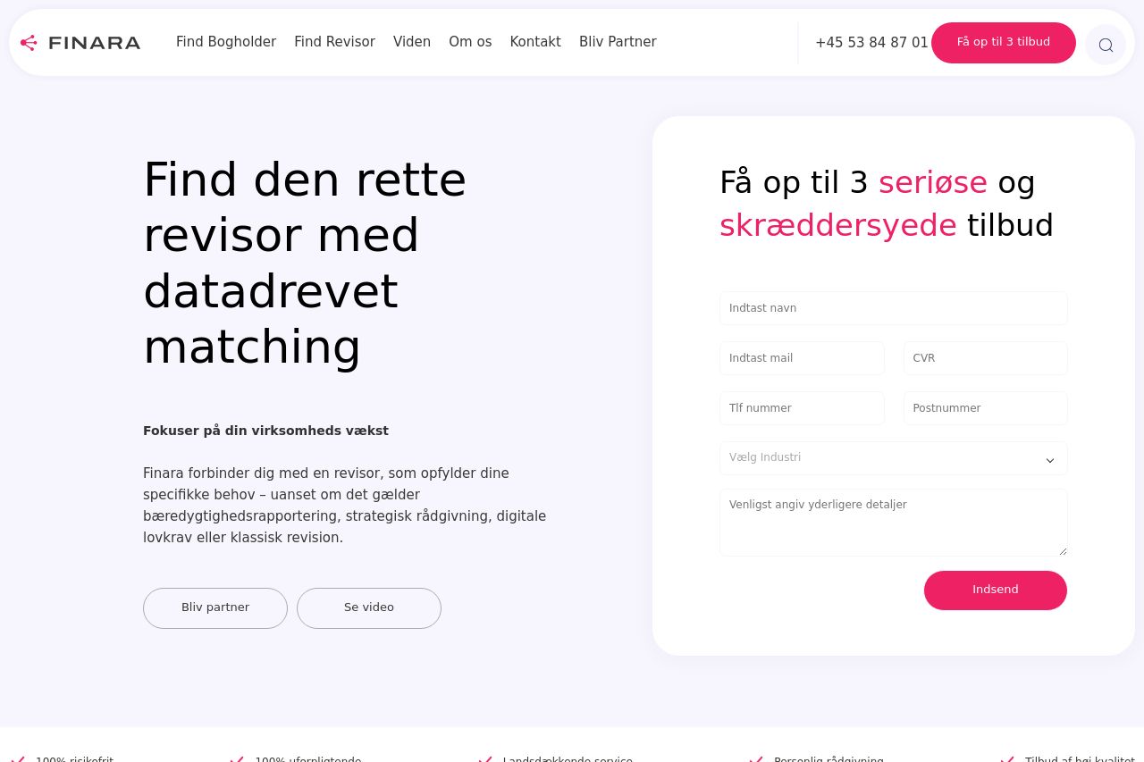
The landing page for Finara is quite functional but has room for improvement. The value proposition is clear from the start, focusing on data-driven matching for finding accountants, yet it lacks a strong visual punch. The hero section tries to convey this value, but it's a bit bland and could use a visual boost.
Readability is decent, but some areas feel too tight and text-heavy. The typography is basic, which is a plus, but the layout could do with more breathing room and visual hierarchy.
Design-wise, the color scheme aligns well with the finance industry and is easy on the eyes, but it doesn’t make important elements pop enough. Consistency is fairly maintained, yet some elements like buttons need more emphasis.
The structure of the page is logical, moving from a value proposition to a detailed explanation of the process, but the overall navigation by headings is weak. Not enough distinct sections and headings to guide the user effortlessly through the content.
Call-to-action elements could stand out more: the current ones blend into the design a bit too much, and this could reduce click-through rates. While credibility is supported by displaying testimonials, further enhancements could be made with more recognizable logos or trust badges.
Overall, it’s a fairly standard landing page that clearly conveys its business purpose but could significantly enhance engagement and conversions with some focused tweaks.
- Highlight the main CTA with a contrasting color to improve visibility.
- Use larger, bolder fonts for headings to improve visual hierarchy and readability.
- Incorporate more visual elements or imagery in the hero section to capture attention.