kristian-juul.dk
Landing Page Analysis
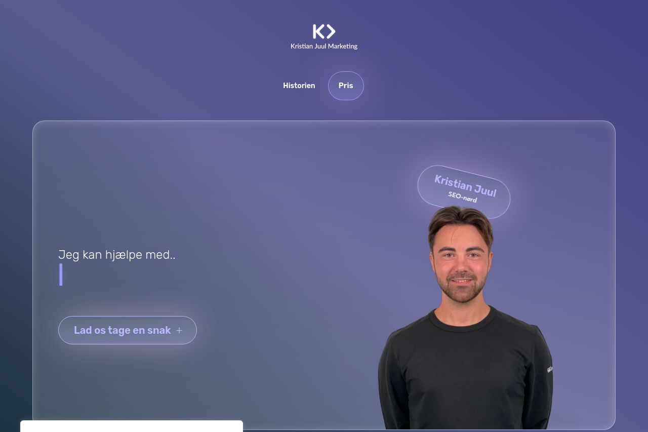
Er du klar til din vækstrejse? Mit team og jeg står klar til at løfte din digitale indsats og øge bundlinjen
Summary:
This landing page attempts a modern and clean design but falls into some typical pitfalls. The hero section uses a calming purple scheme and a somewhat professional image, but the value proposition, "Jeg kan hjælpe med," is too vague and doesn’t immediately convey what problem is being solved. Repetition of "Lad os tage en snak" feels generic and uninspired. The value of the services isn't clear at first glance, and there's too much reliance on cliché phrases. Social proof with client logos is a plus, yet they can get lost due to low emphasis. Headings and call-to-action buttons lack distinction and urgency, blending into the background. CTA placements are decent but lack punch and persuasive copy.
Text boxes are cluttered with equal emphasis, making it hard to discern priorities and the reading flow is disrupted by the cluttered feel. Some sections attempt to capture attention with colors and boxes, but instead feel scattered, reducing credibility and professionalism. This page is a classic case of style over substance, trying to look slick but missing a clear message and a memorable impression. The layout lacks strong guidance through the content, which could diminish visitor engagement.
- Clarify the main value proposition prominently and specifically on the hero section.
- Increase contrast for headings and CTAs to improve readability and engagement.
- Refine and focus on the messaging to make the benefits clear and directly related to the user's needs.