videoaieditor.app
Landing Page Analysis
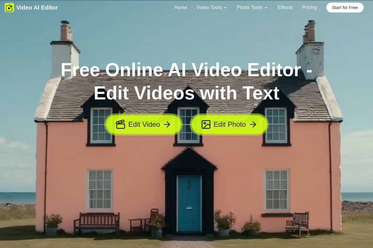
The ultimate AI video editor. Use text prompts to instantly edit, transform, and enhance your video. Get fast, professional, high-quality results.
Summary:
The landing page effectively establishes the product's purpose with a clear headline and attractive visual design. However, the overall experience is marred by some issues that hold it back.
Messaging is somewhat scattered, with an extensive but overwhelming list of features. The product's benefits are mentioned, but the page fails to connect these benefits directly to user needs. The lack of audience targeting is noticeable; specifics about who will benefit the most from these tools need clarity.
Design elements are consistent, but the page suffers from a lack of distinct visual hierarchy.
Distinctive colors and contrast are used well, making CTAs visible, but they feel a bit cluttered and overpowering in places.
The structure could be simplified. The long list of features and frequent CTAs give a sense of clutter rather than coherence. Whitespace isn't optimally used, and the content isn't engaging or easy to navigate.
Call-to-actions are prominent, albeit somewhat repetitive and not clearly tied to actionable steps, making them feel generic.
Credibility is lacking due to absent social proofs or trust badges, which reduces perceived trustworthiness and professionalism.
Overall, the page shows potential but requires refinement in strategic prioritization and audience engagement to truly make an impression.
- Focus the messaging on specific user needs or target audience benefits.
- Simplify the structure and navigation by removing redundant elements.
- Enhance credibility with social proof like testimonials or client logos.