framer.website
Landing Page Analysis
Made with Framer
Summary:
The landing page for StudioOne definitely has some strengths but also glaring weaknesses.
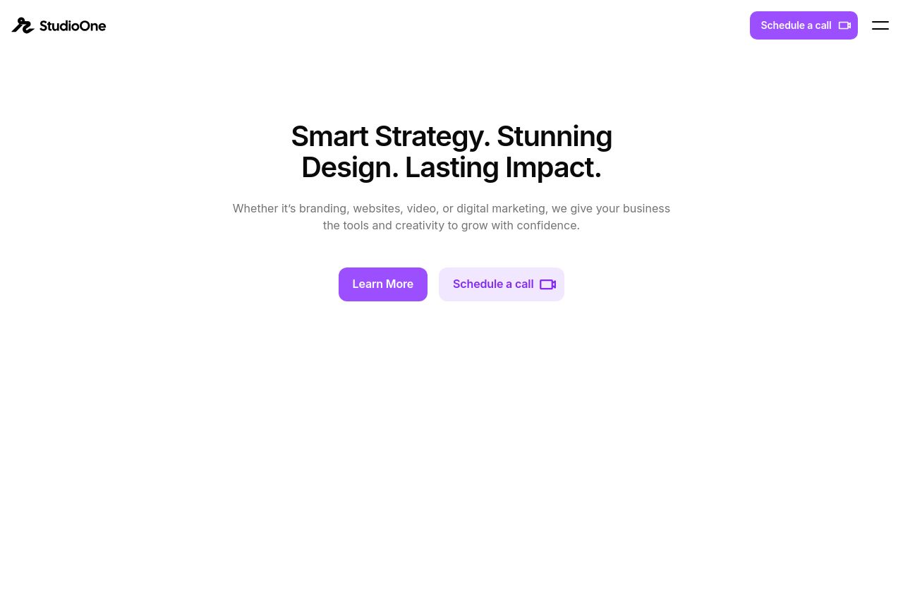
The layout showcases a minimalistic and clean design, which is generally appealing and professional. The use of whitespace is commendable, but there's too much of it, especially in the hero section, making the top feel barren and unwelcoming. The CTAs like "Learn More" and "Schedule a Call" are clear but lack any urgency or compelling language to truly entice action.
The messaging struggles with specifics. Phrases like "Smart Strategy. Stunning Design. Lasting Impact." are vague and feel like generic buzzwords. The page doesn't really paint a vivid picture of what exactly customers are getting or who the target audience is. The content is too broad, lacking tailored specifics or standout features to captivate a precise audience.
Design-wise, the consistent use of purple helps with visual cohesion, yet doesn't create much excitement or engagement. While the color choice might suit the brand identity, it's not used effectively to draw attention to critical areas of the page.
Social proof is well presented with testimonials and team member visibility, improving credibility. The team showcase humanizes the brand and adds warmth, but more emphasis on individual contributions or stories could better hook potential clients.
The site’s "Projects That Drive Results" section is a good concept, but the accompanying images need to be more compelling and visually dynamic. The portfolio showcases some work but lacks detailed descriptions or client outcomes to add weight to the visual elements.
In summary, while the foundational elements are in place, the page misses on specificity, strong calls-to-action, and leveraging visuals for maximum impact. The tone lacks excitement and the messaging needs to hit closer to home with actionable insights or clearer benefits.
- Enhance the value proposition with specific client outcomes or benefits.
- Create a more engaging CTA with action verbs and urgency.
- Use more dynamic and engaging visuals in the project showcase.