enesa3.com
Landing Page Analysis
Galmed Steel: acero galvanizado en caliente por inmersión. Bobinas y chapa, recubrimientos Z/ZM según EN 10346. Producción en Valencia con calidad y plazos.
Summary:
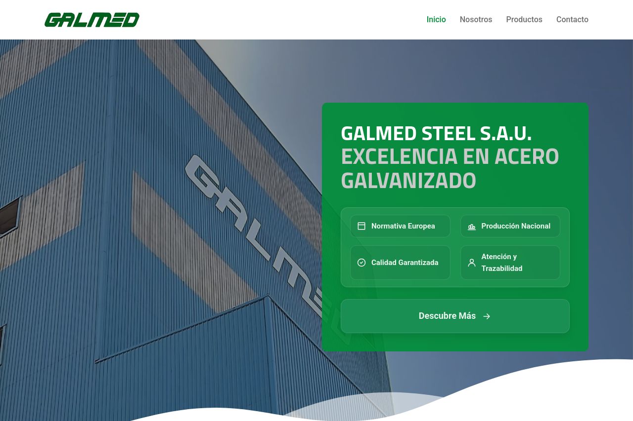
The landing page for Galmed Steel S.A.U. is quite coherent in terms of branding, but it lacks punch in several key areas.
Messaging is straightforward yet lacks depth when it comes to specific audience targeting. For example, while the general information about galvanized steel and its advantages is present, there's a lack of specific examples or success stories to resonate more deeply with users. The tone is professional, which is appropriate, but could do more to draw in users with engaging content.
Readability is average, with basic and clear typography, however, some areas look dense because of text blocks. Some headings are slightly smaller, making them less distinct from regular text, which could affect overall navigation and consistency.
Design elements show a degree of clarity, thanks to consistent color usage and a reasonable layout. However, the visual hierarchy could be more pronounced to guide users more effectively, especially for CTAs that could blend into the background due to insufficient emphasis.
Structure-wise, this page is a bit too uniform. The layout is linearly organized, which is tidy but also misses an opportunity to hook users with strong content that presents core values and benefits right at the start. The section divisions are clear but lack engaging transitions, which could help hold interest as users scroll.
In terms of actionability, CTAs are present but lacking in persuasive language and strategic placement. They tend to blend with the content rather than stand out, diminishing their effectiveness.
Credibility is decent, thanks to info about the location and contact options; however, there's a glaring lack of social proof elements like customer testimonials or trust badges that boost authenticity.
The Open Graph data is mostly absent, with crucial fields like description missing entirely, and the image used is uninspiring with low engagement potential.
- Enhance the value proposition with specific use cases and customer testimonials.
- Improve CTAs with better placement and stronger action-oriented language.
- Increase the visual hierarchy through distinct headings and better contrast.
- Incorporate more social proof elements for credibility.